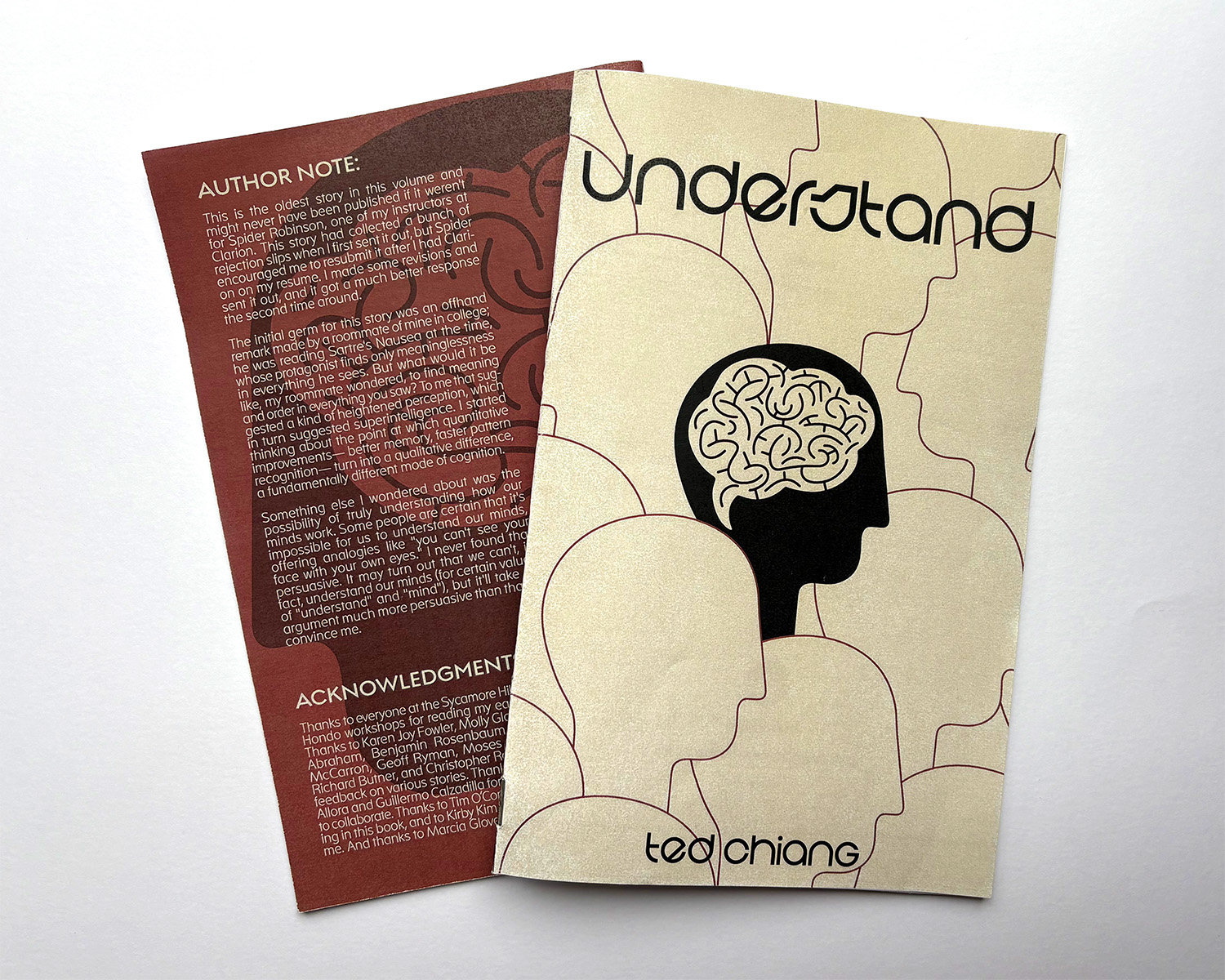
To further understanding of type setting and develop physical craft skills, a short story booklet from the author Ted Chiang was designed through Adobe Indesign and Illustrator.
First Round Cover Concepts:
Understand is a short story following a man who is given experimental injections to restore his neural structures after they were damaged. These injections lead to him becoming hyper-intelligent and on the run, all while considering the impact he can have on others and the world.

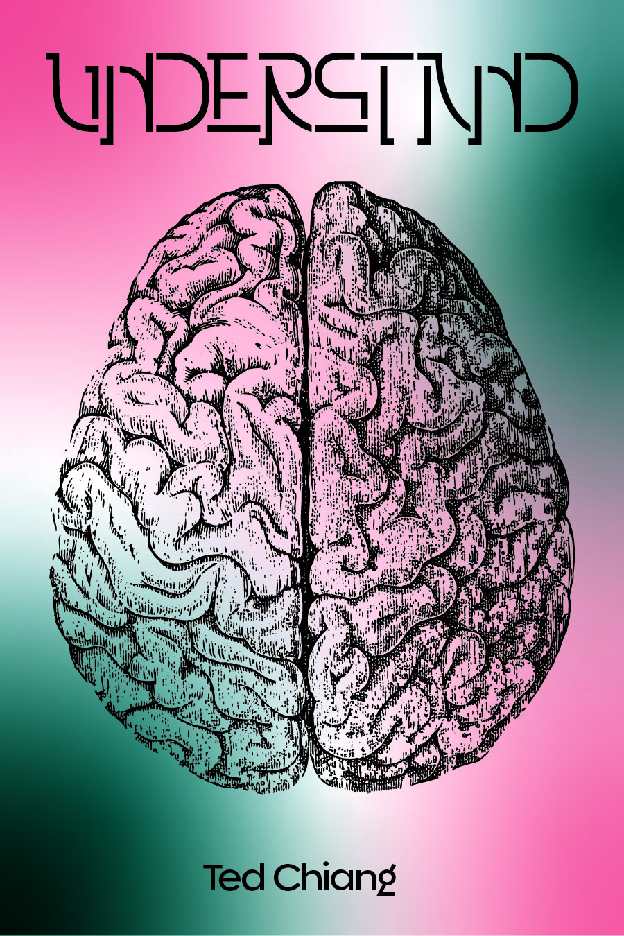

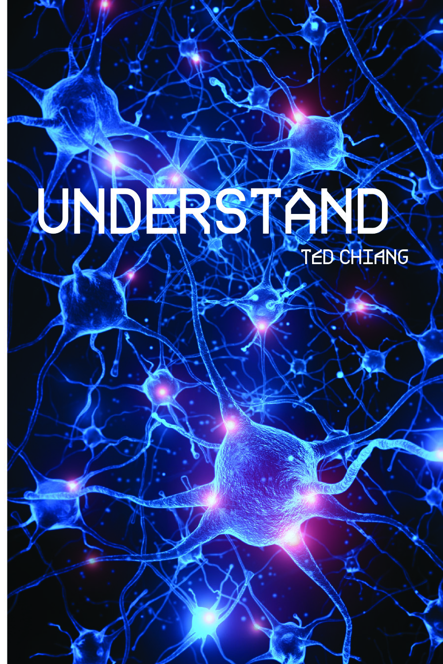
The singularity of the man in his hyper-intelligence and the brain are the focus of the cover concepts, both in imagery and text design. In an attempt to comprehend his increased intelligence, the character Leon attempts to create his own language based on mathematical concepts, but is limited by the human vocal range and the impossibility of making it a written language. The abstracted language was an important factor in typeface choices both on the cover and within the content of the booklet.
Second Round Cover Refinement:
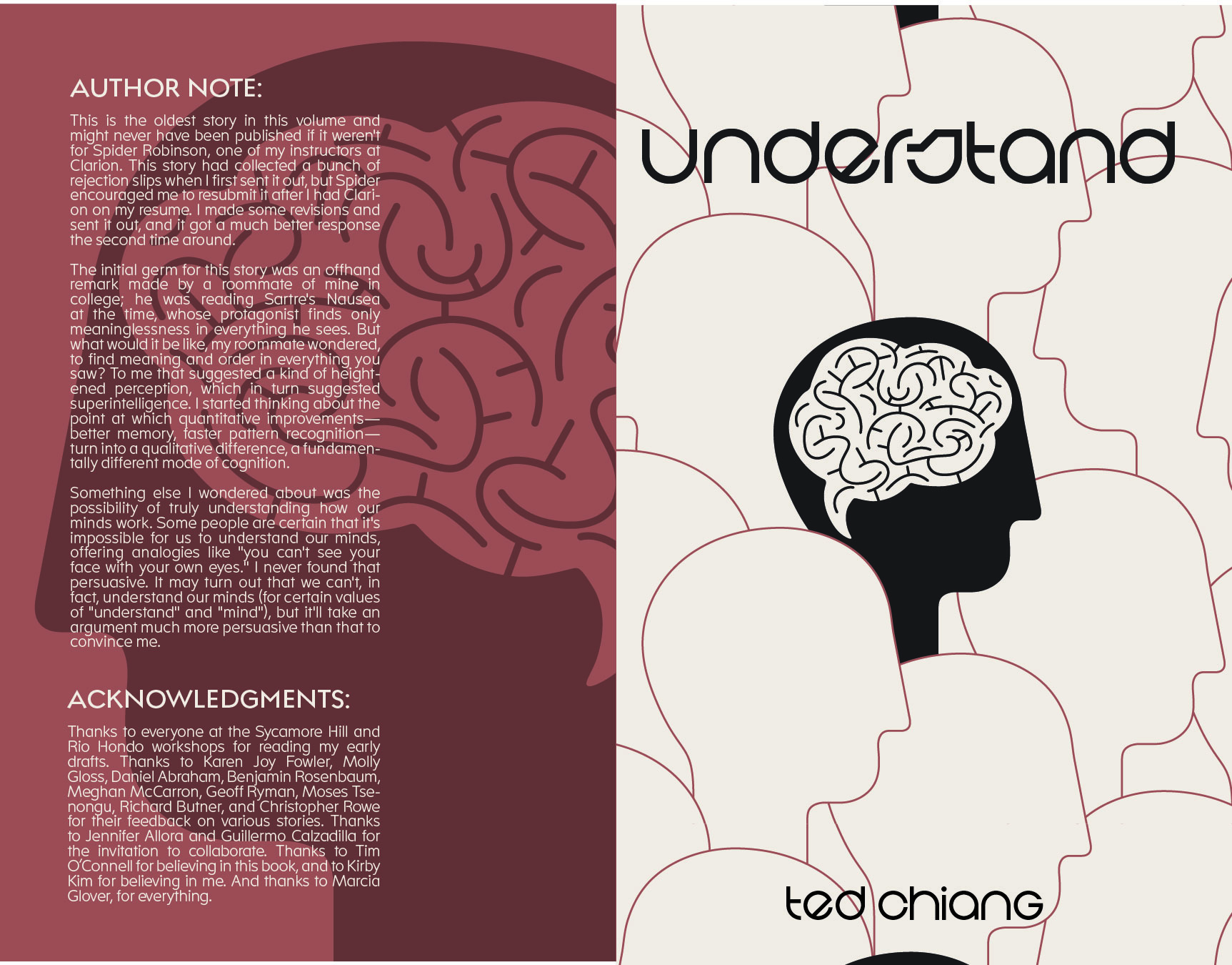
A back cover was created from the color palette and vector imagery from the cover, adding the author’s note and acknowledgements to the back of the booklet.
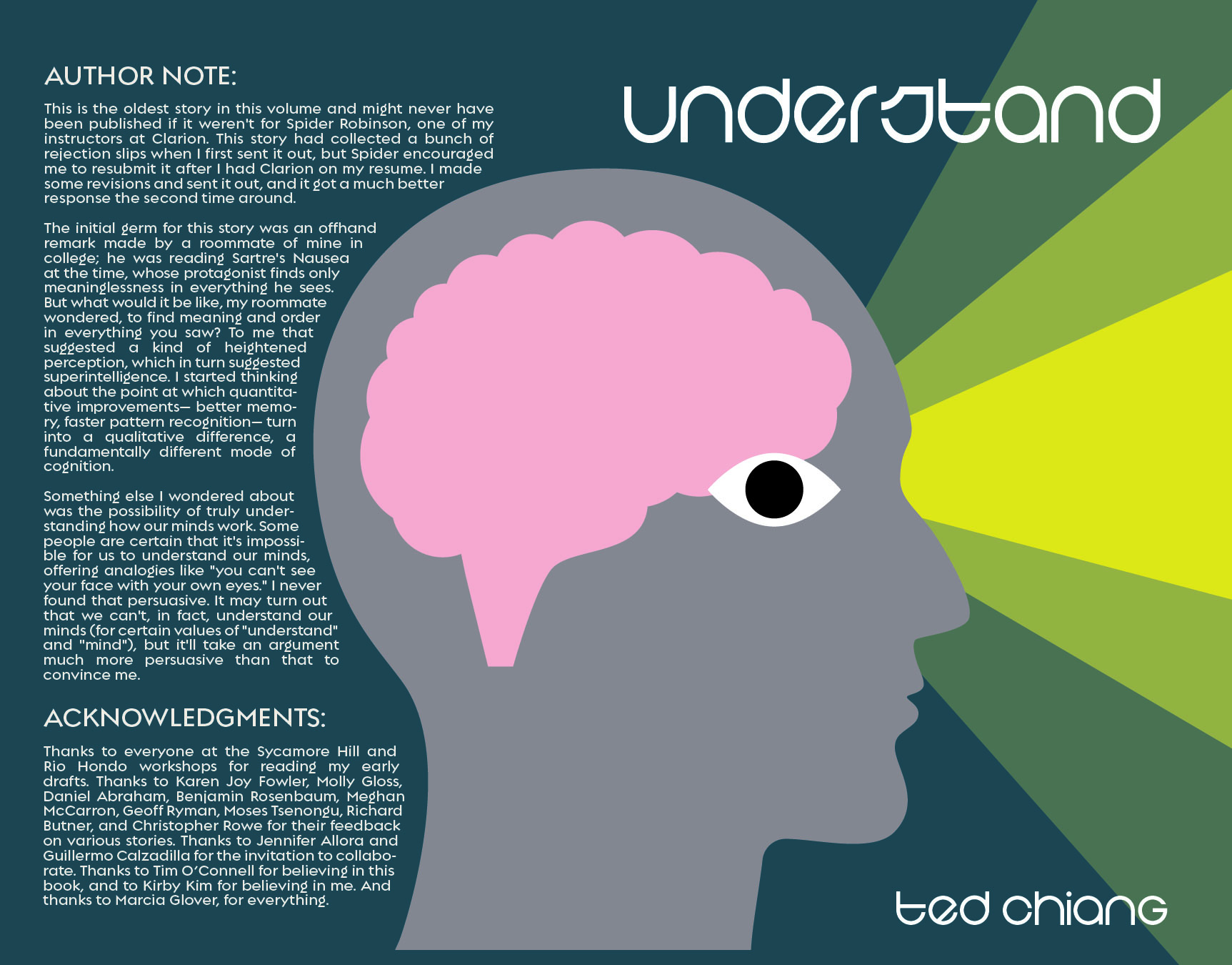
The head was extended to the back cover, creating a continuous flow. The lines of the brain were removed to unify the flatness of this cover concept.
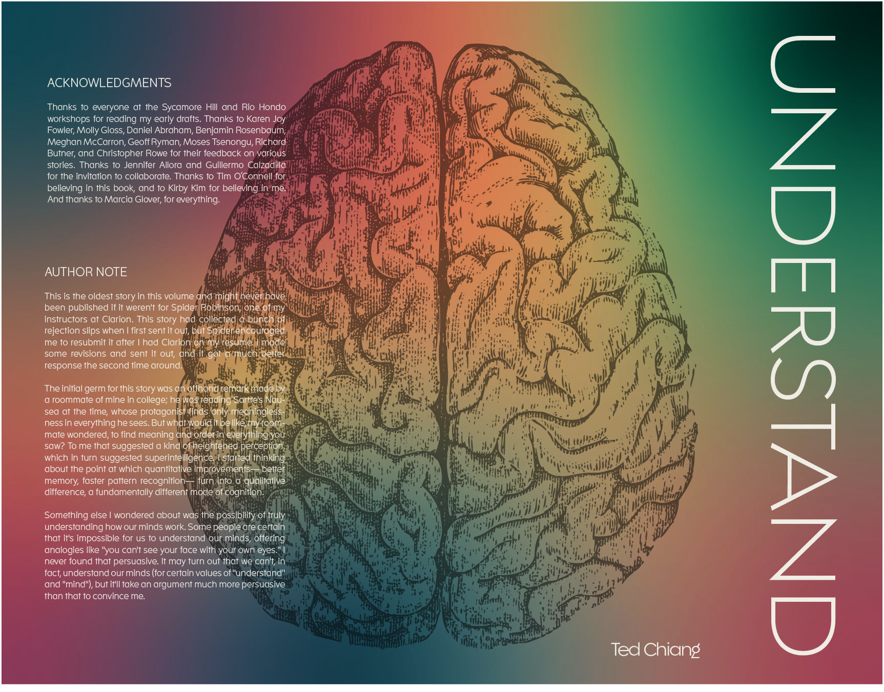
This cover also now includes a continuous image from front to back and the gradient color palette has changed to become smoother and more moody.
Final Digital Cover
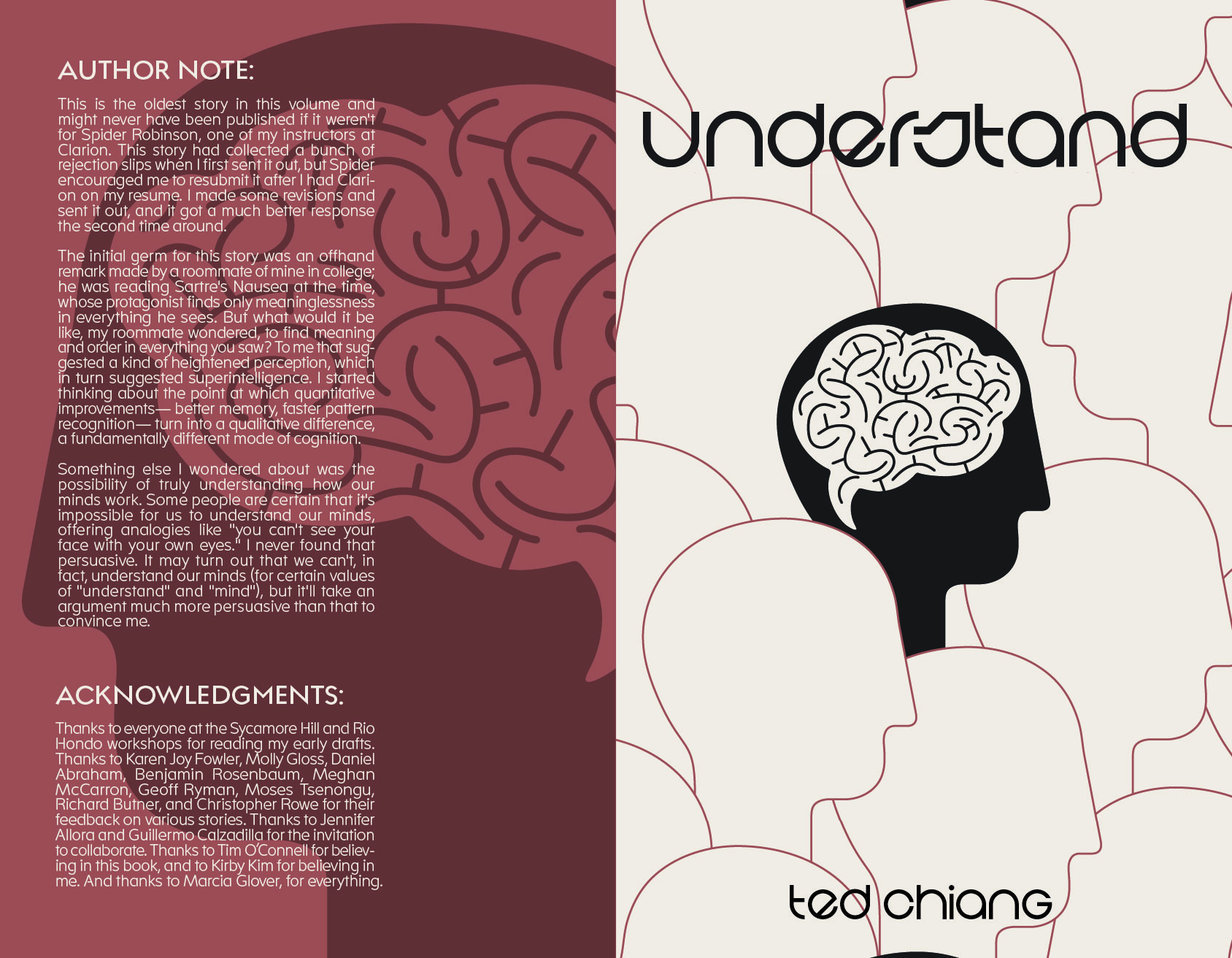
While the cover ideas were being refined, the text on the interior of the booklet was simultaneously being formatted and refined in InDesign. Due to the binding process, all booklet pages had to be in a multiple of four, creating intentional blank pages and formatting shifts.
Final Printed Booklet
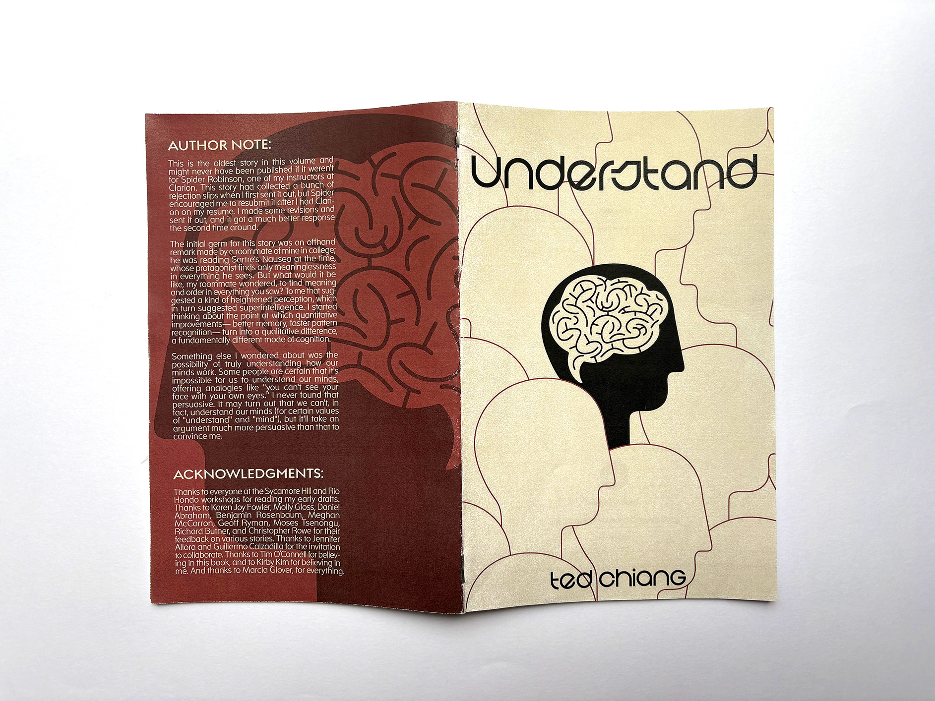
The final cover and booklet were printed and assembled by hand, utilizing analog craft skills to effectively align, trim, and assemble the booklets.
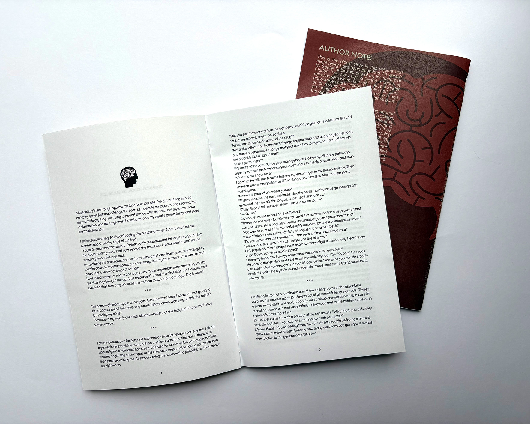
The final interior typeface is a sans-serif that has slight spaces in the letterforms, standard curves, and straight lines creating a sense of disconnection from natural human handwriting. Balancing readability with the sense of non-human language was crucial to the intended effect on the reader.
