Romantic Typefamily
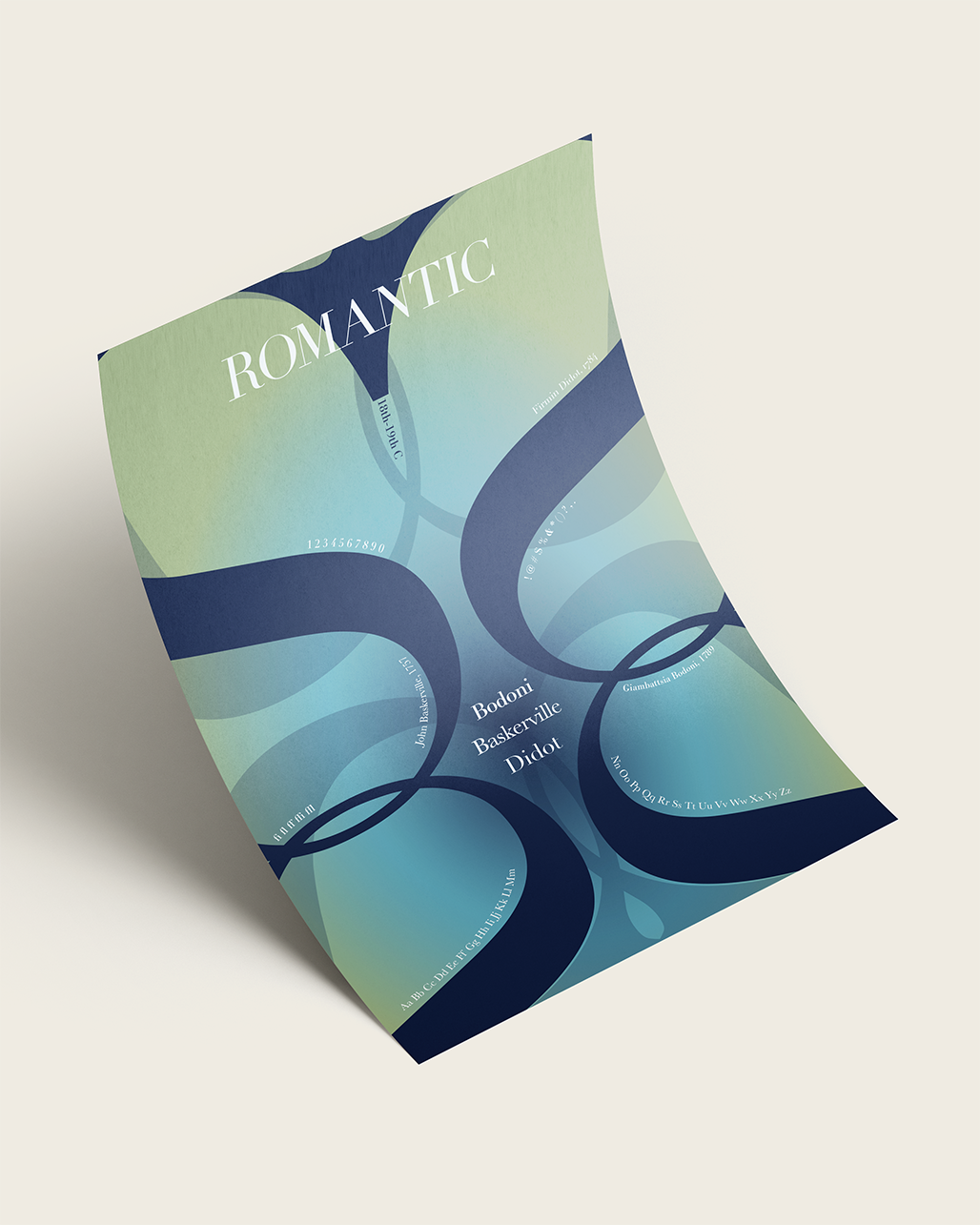
For this assignment we researched a type family category, mine being Romantic style typefaces. These typefaces are categorized as having high contrast between their thicks and thins, smooth curves, and defined serifs.
I chose to utilize the letter S to create abstract forms to base my composition around, adding the information around the swooping lines that lead the viewer’s eye around the composition.
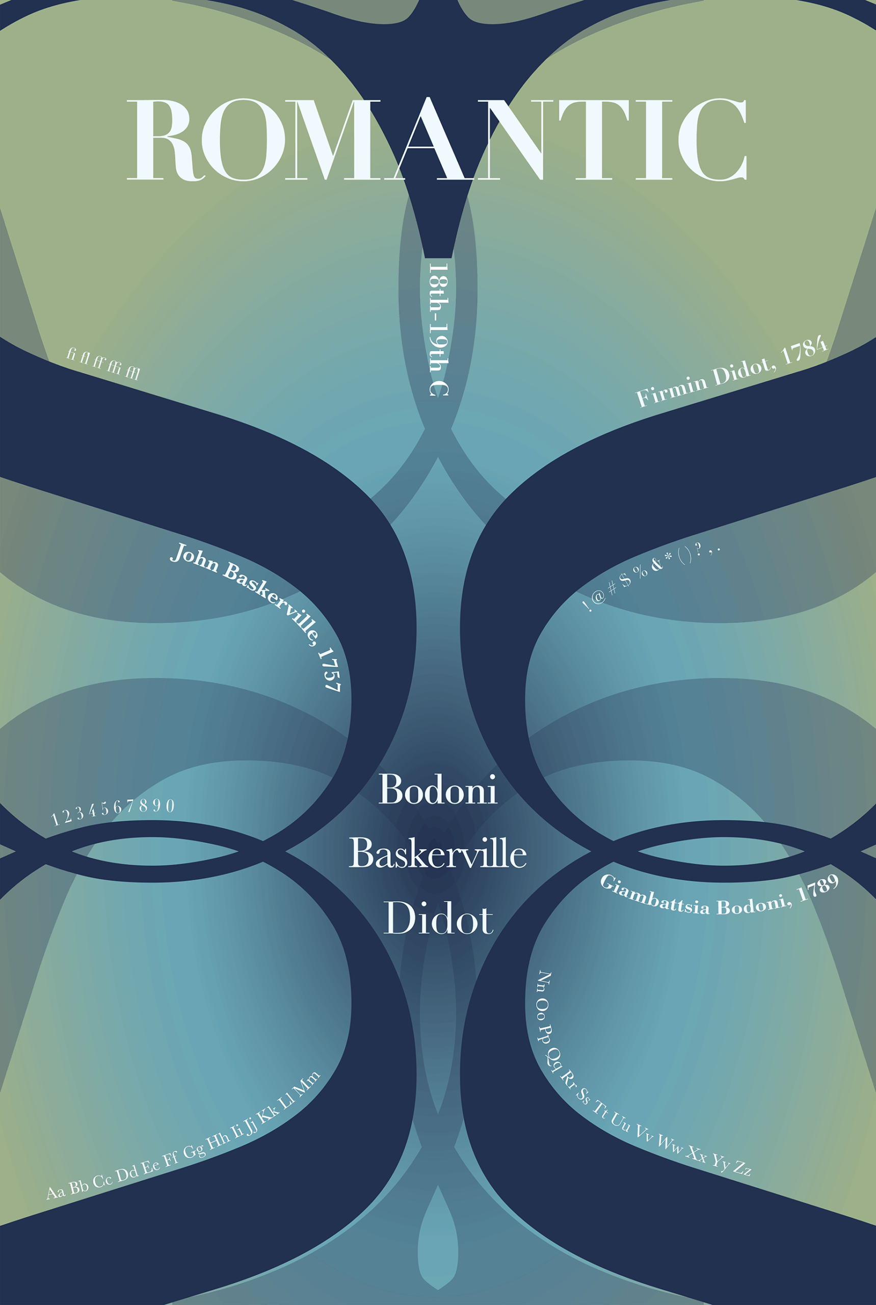
Romantic Style typefaces are commonly used in high-end magazine titles and in luxury branding due to their high contrast and elegant look. I chose to incorporate colors common in this type of branding as the color scheme of my composition to inspire these connections.
Three Previous Iterations:
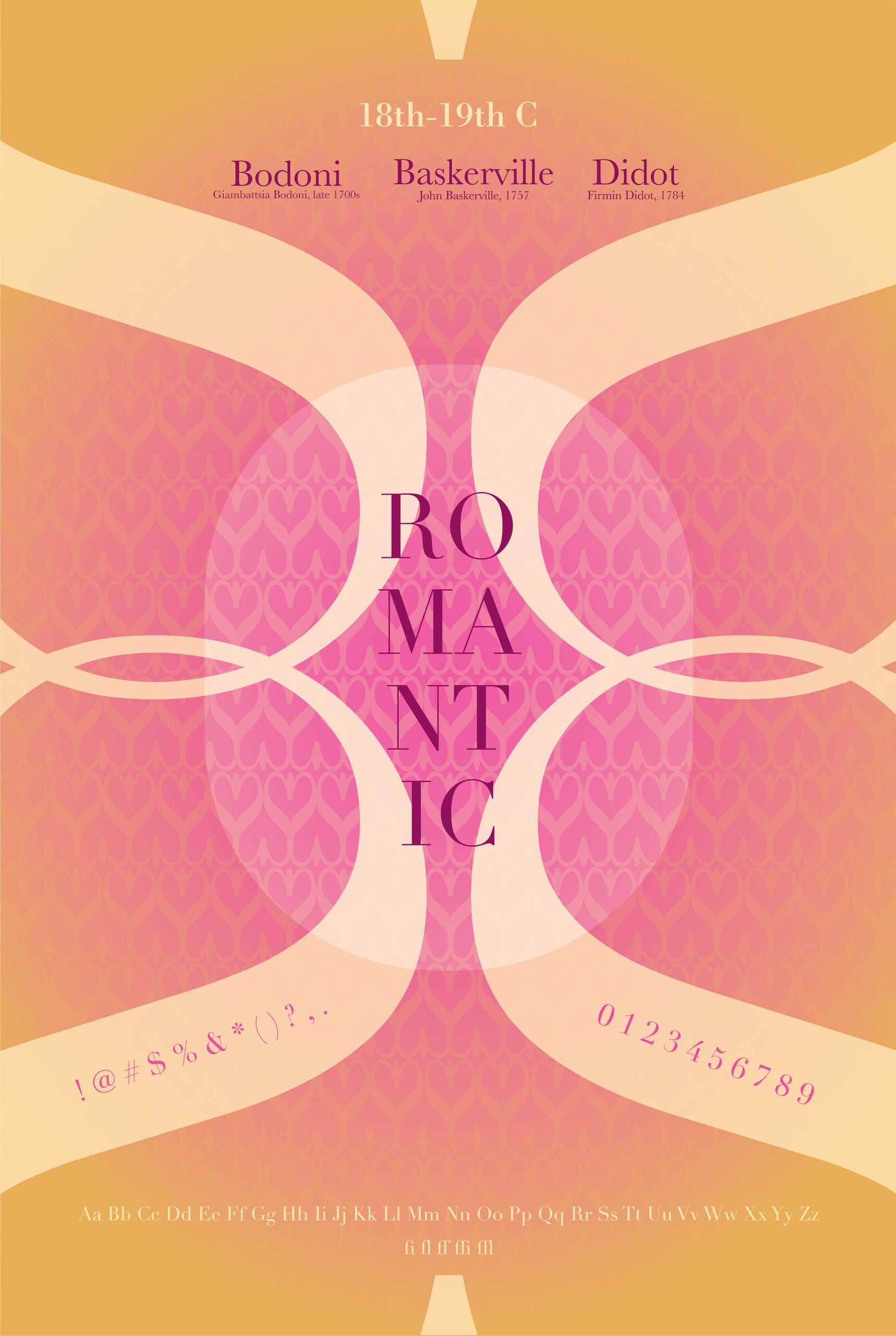
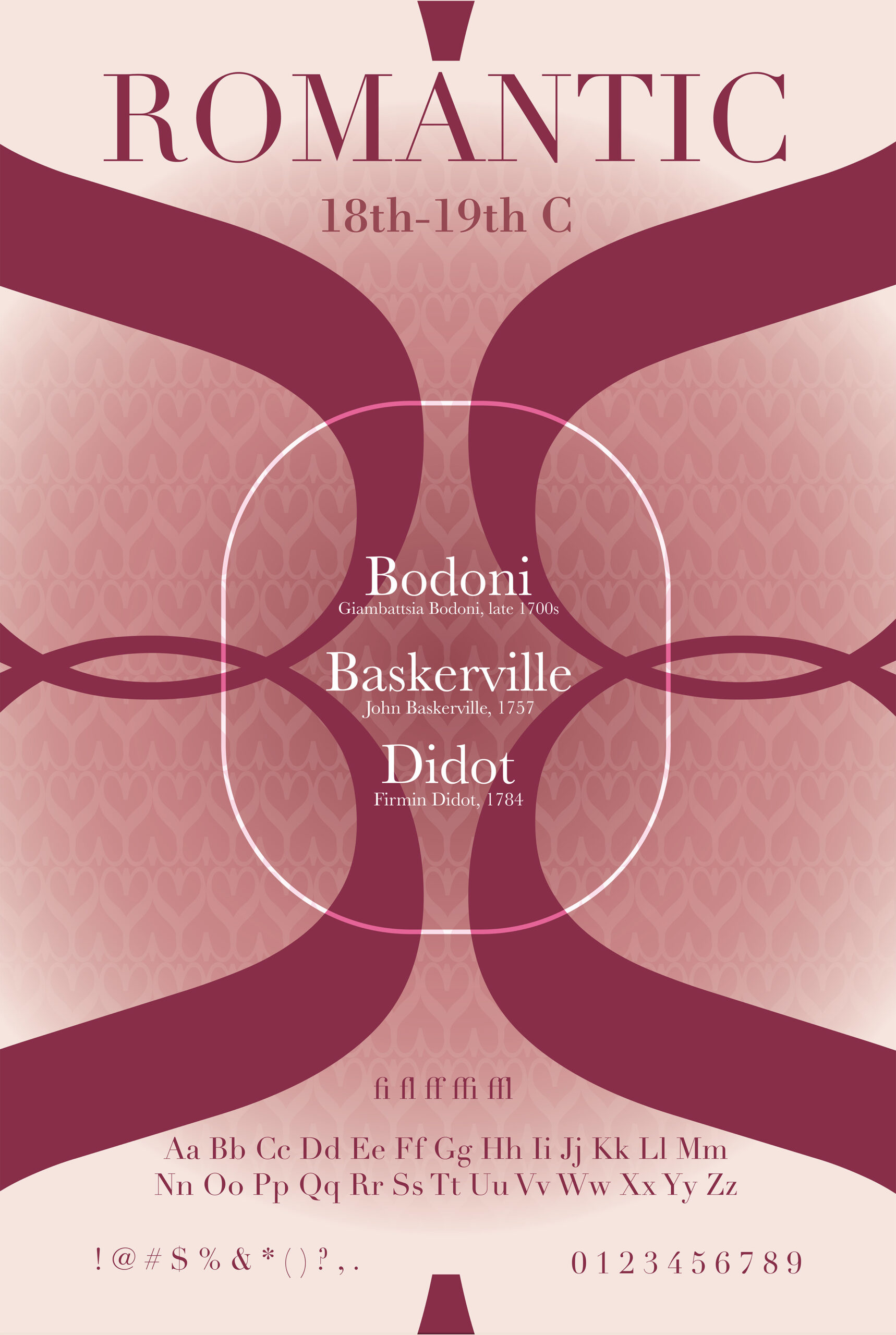
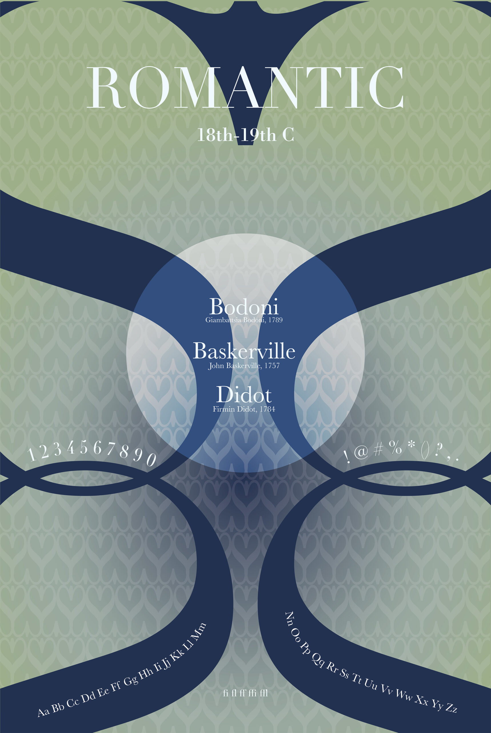
These designs were further refined to create the final composition seen above. Extraneous elements were removed, and perfect symmetry was broken to further engage the viewer.