Editorial Magazine Spread
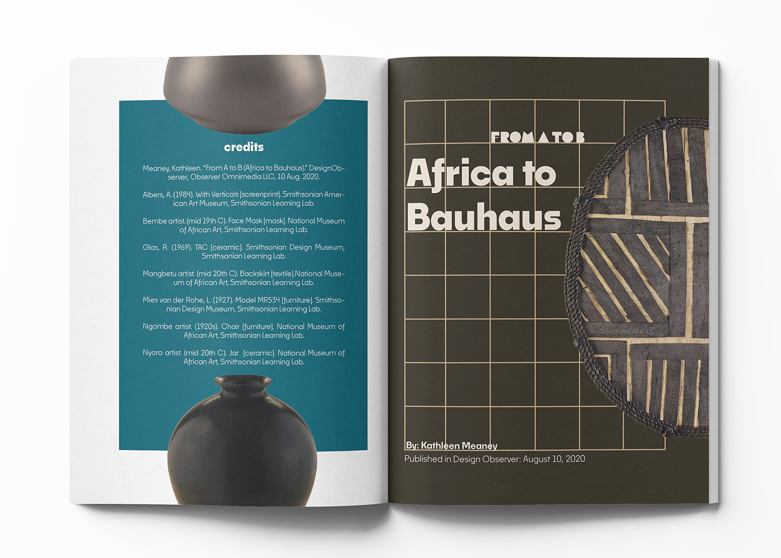
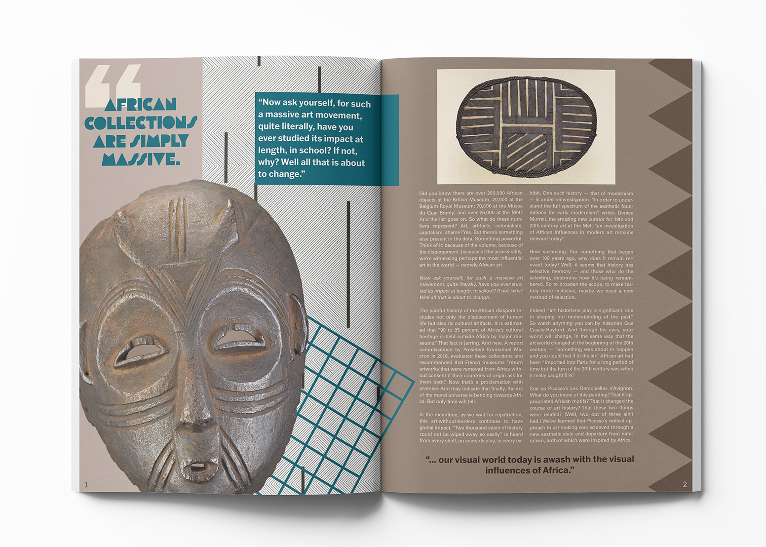
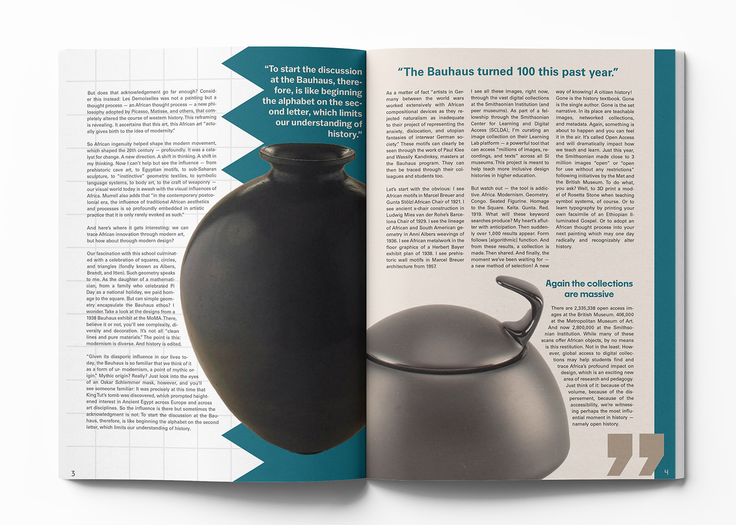
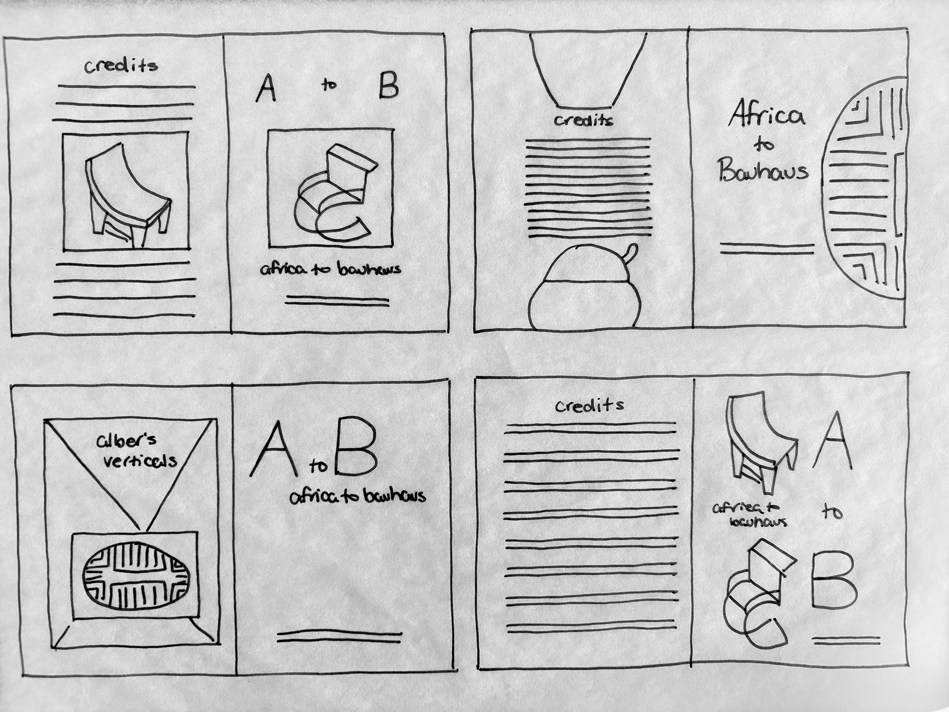
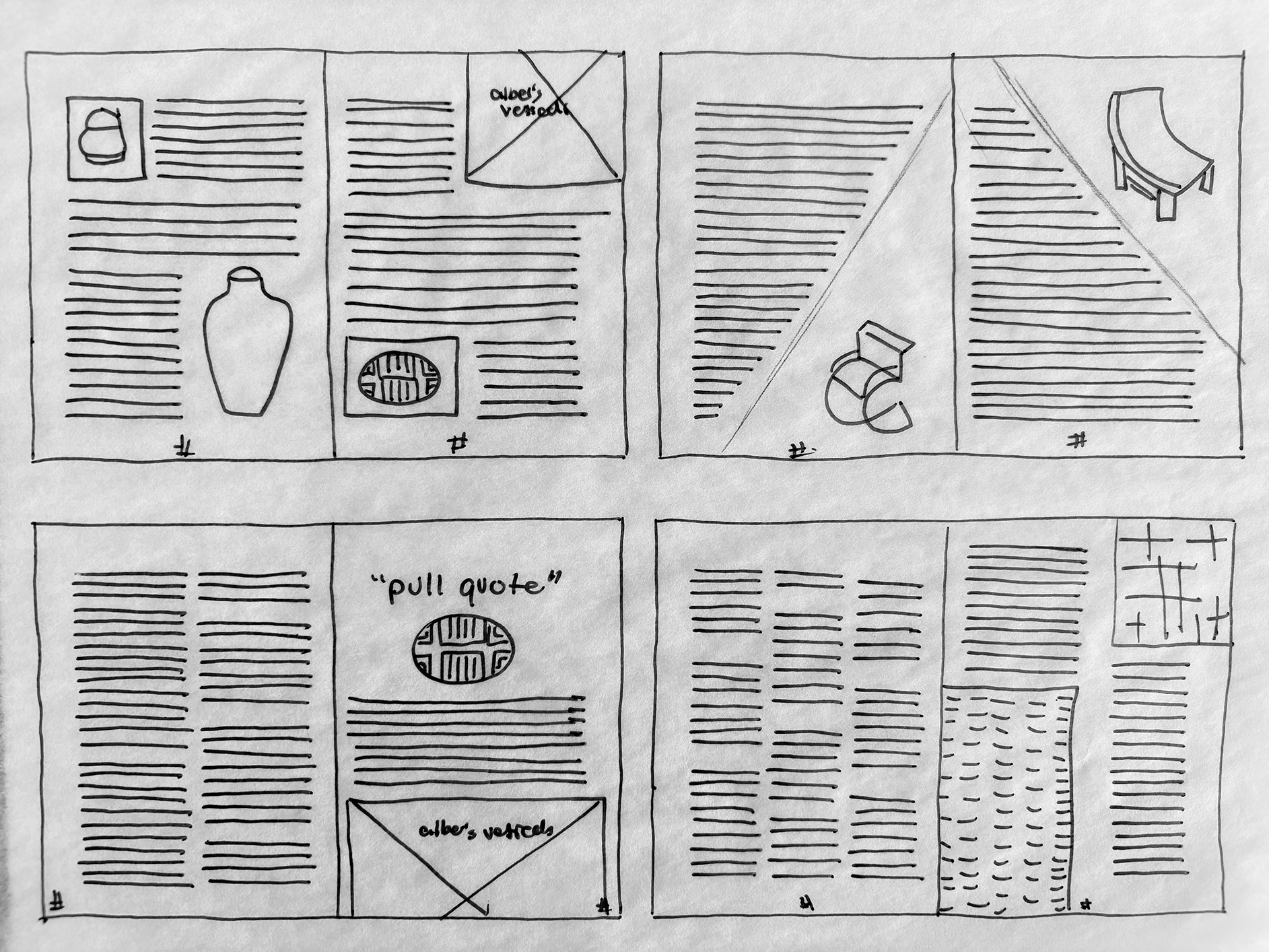
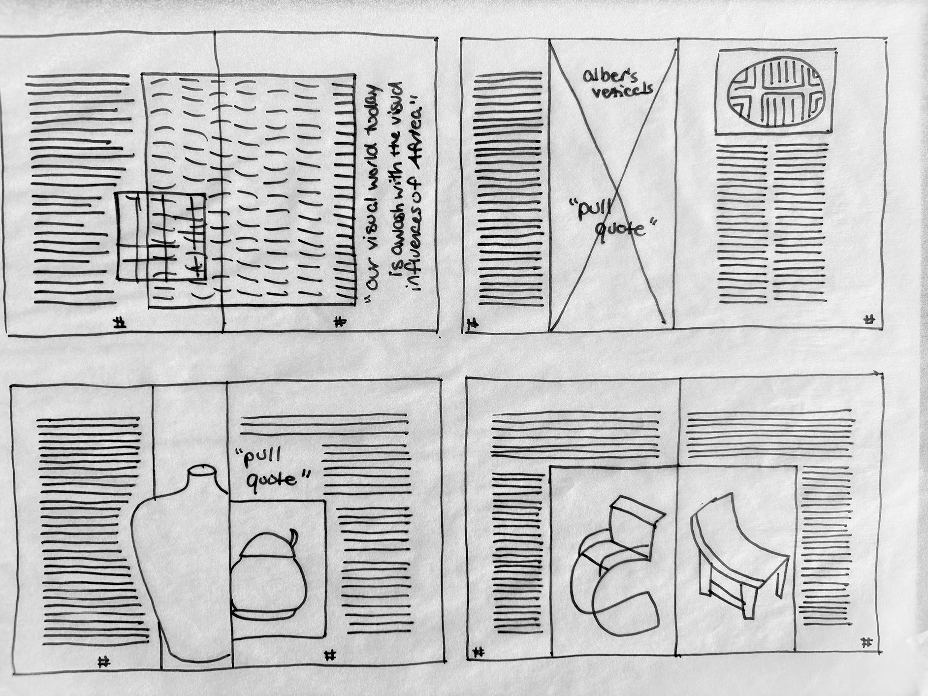
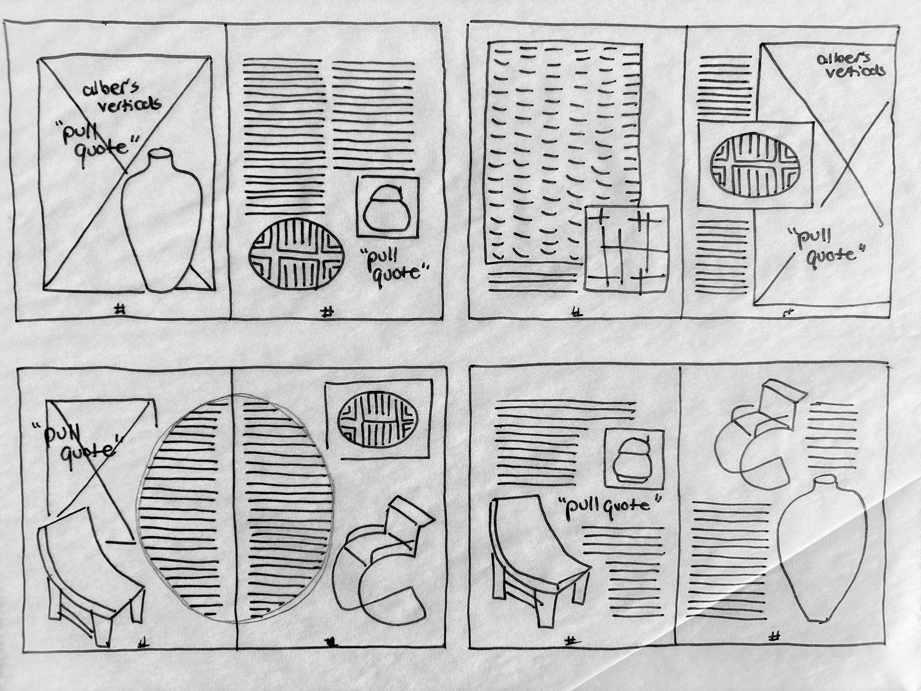
For this assignment, we made editorial spreads based on the content of Kathleen Meaney’s A to B editorial. I chose to emphasize the comparison between African Art and Bauhaus Design through the repeated geometric motifs of both styles and works.
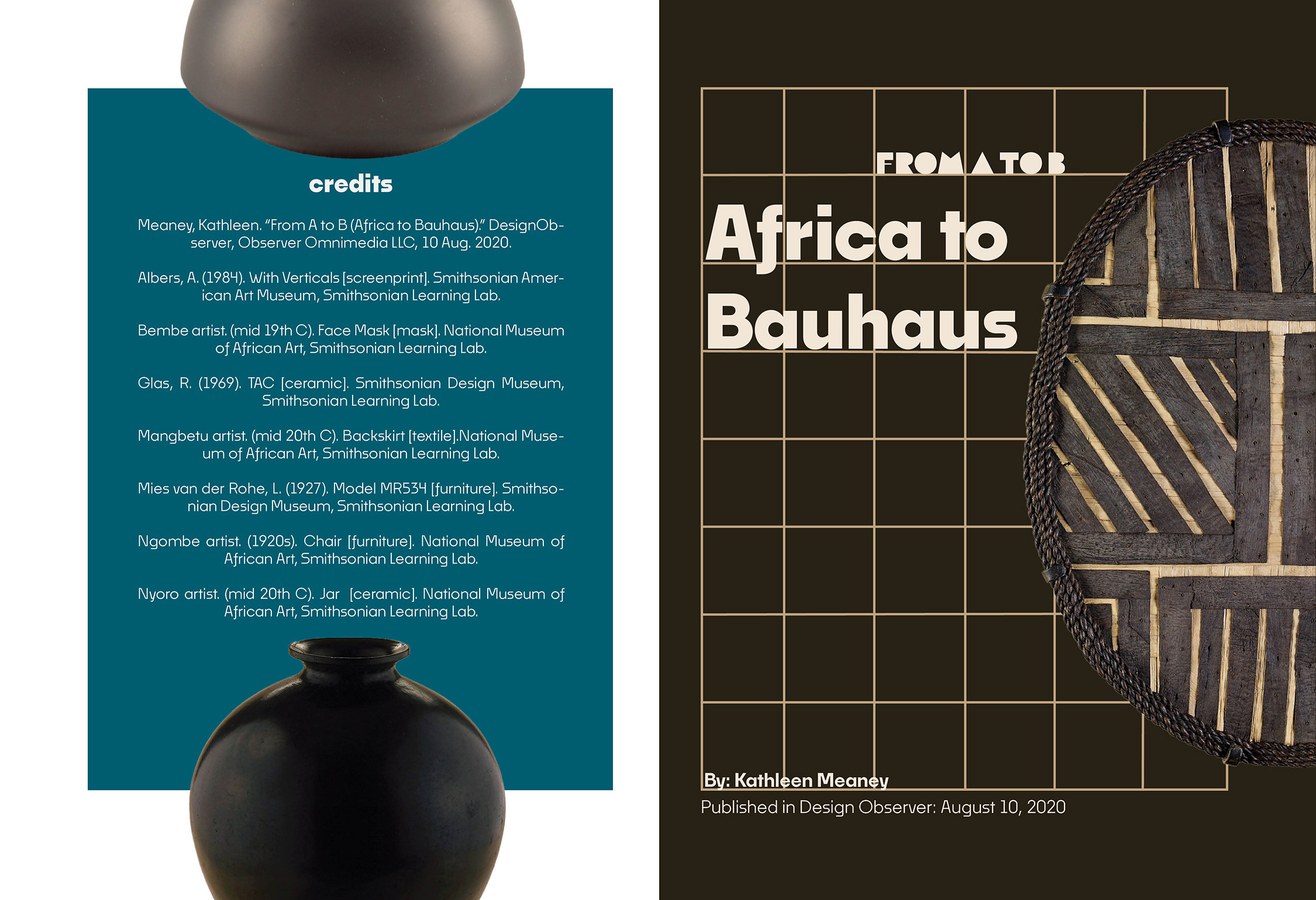
I selected the color palette from the images themselves, and added blue as a pop of color to prevent the spreads from becoming too monotone.
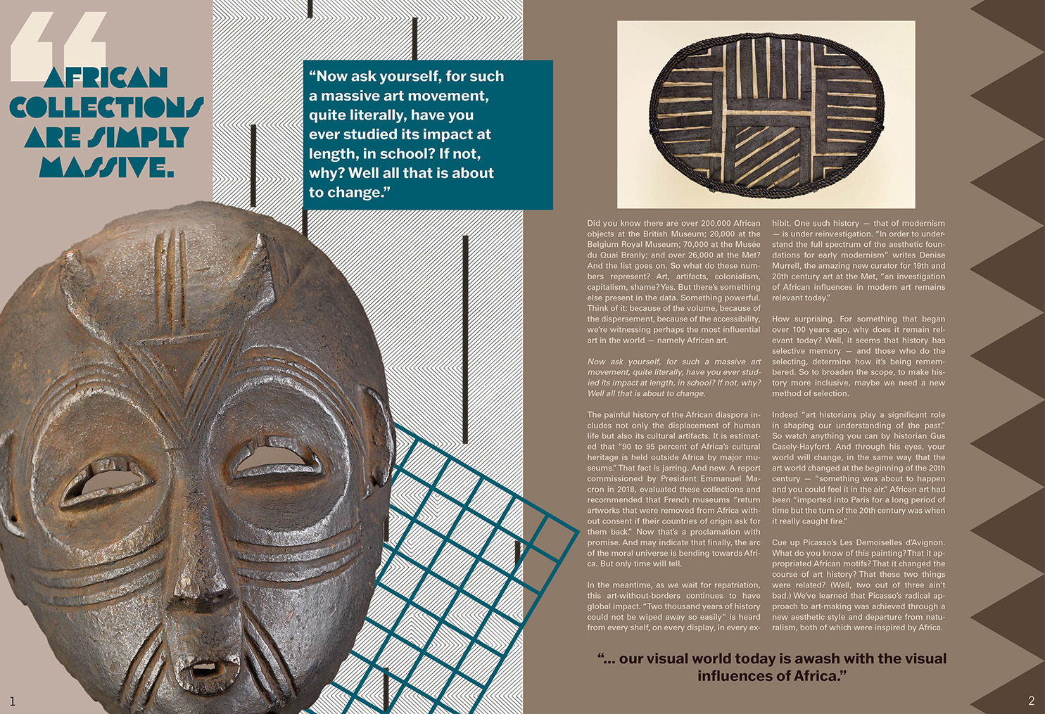
This project required focus and attention to small details such as widows on text and proper formatting to avoid hyphens or other less appealing text qualities.
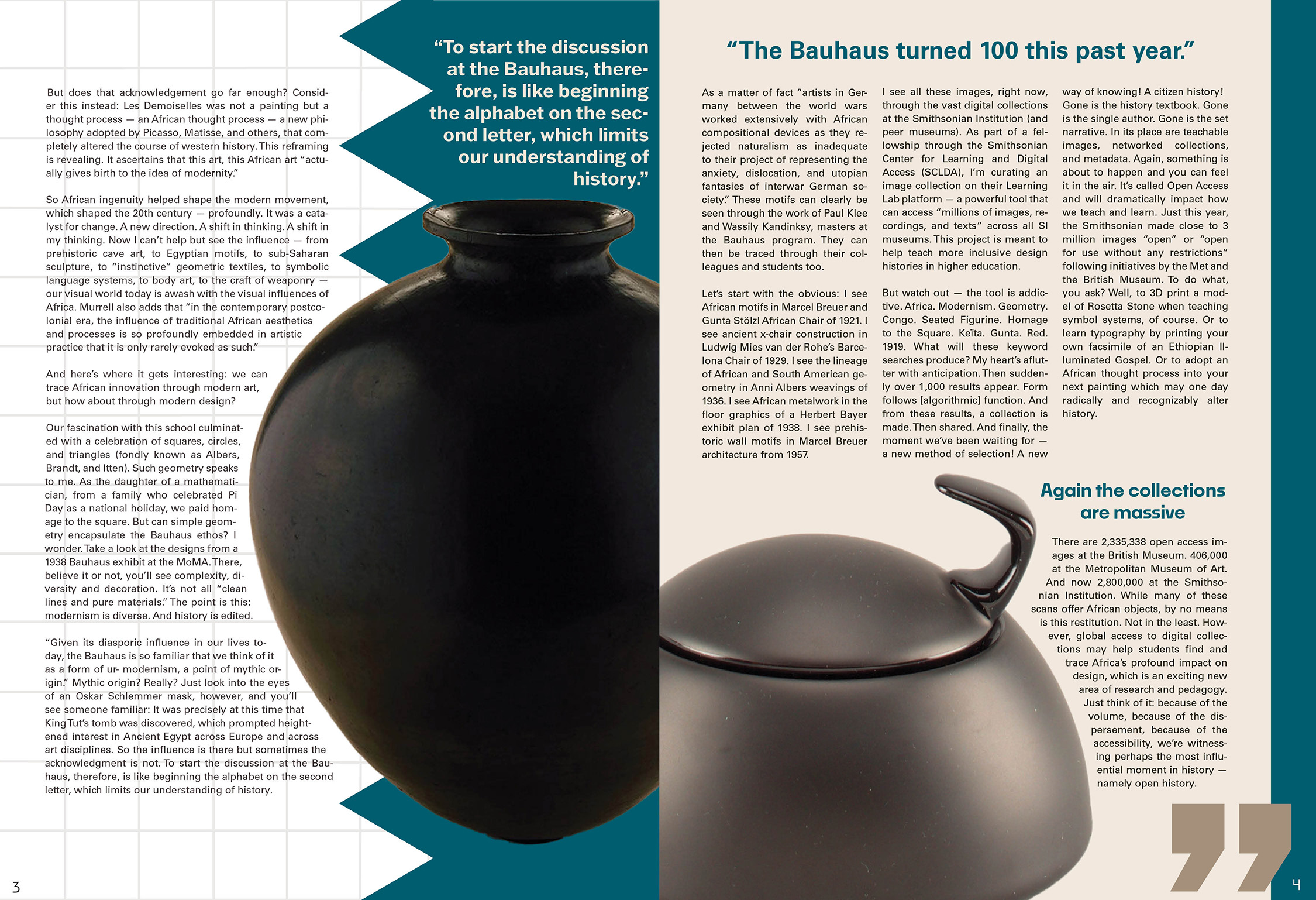
I learned skills in both InDesign and Photoshop through the execution of this editorial, expanding my knowledge and applicable skills when working on other projects.
Process Sketches:
