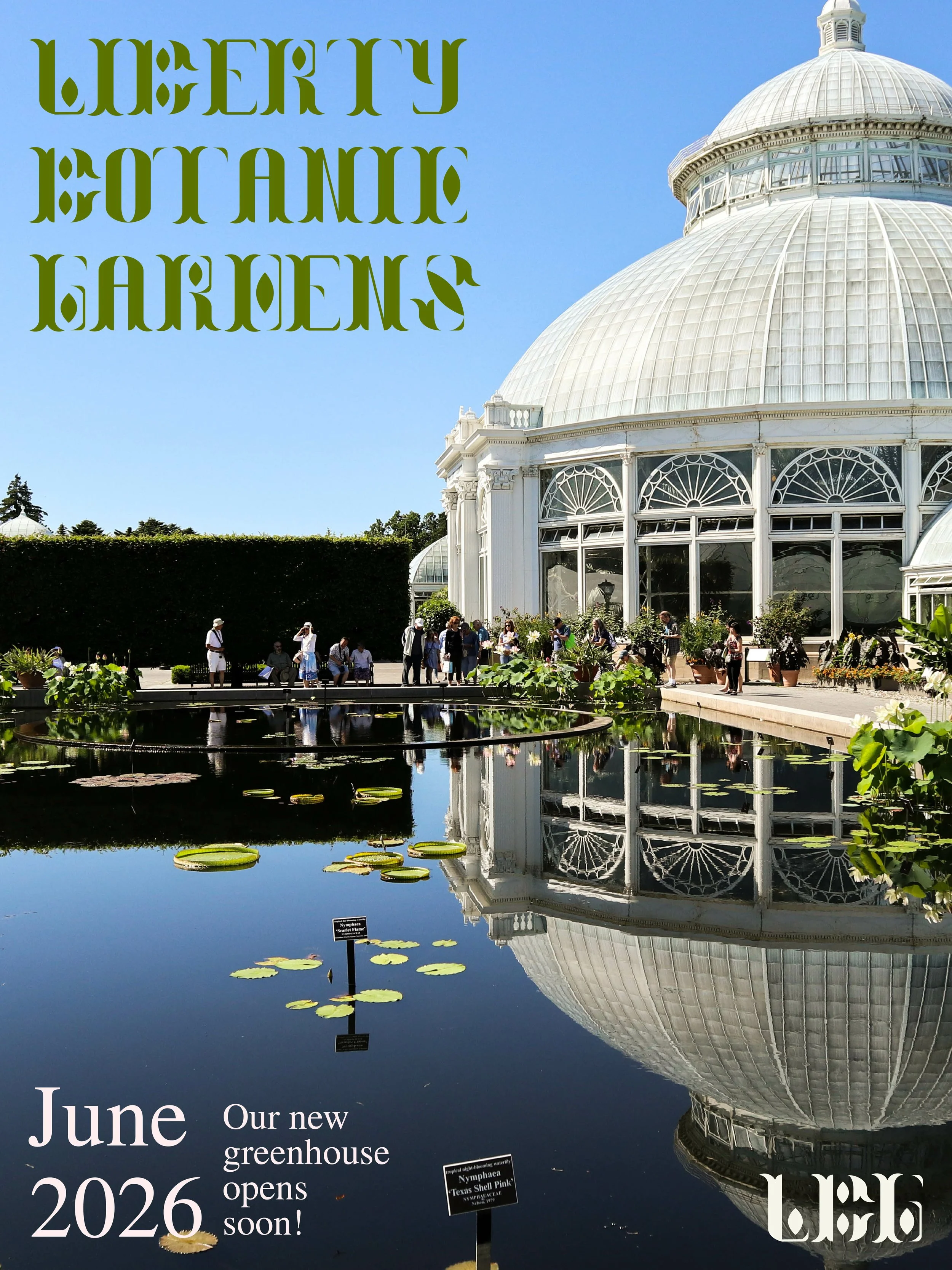
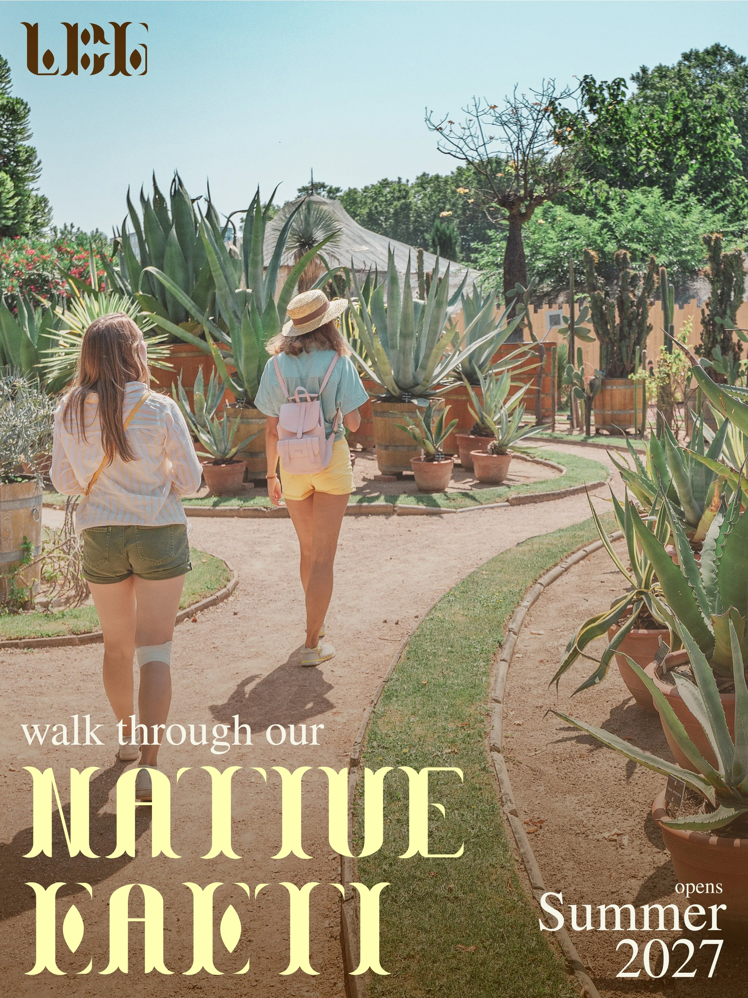
Display Typeface Design
The Greenhouse typeface was created for Liberty Botanic Gardens, a hypothetical institution in Philadelphia, Pennsylvania that would research and educate about the importance of native plant species in North America.
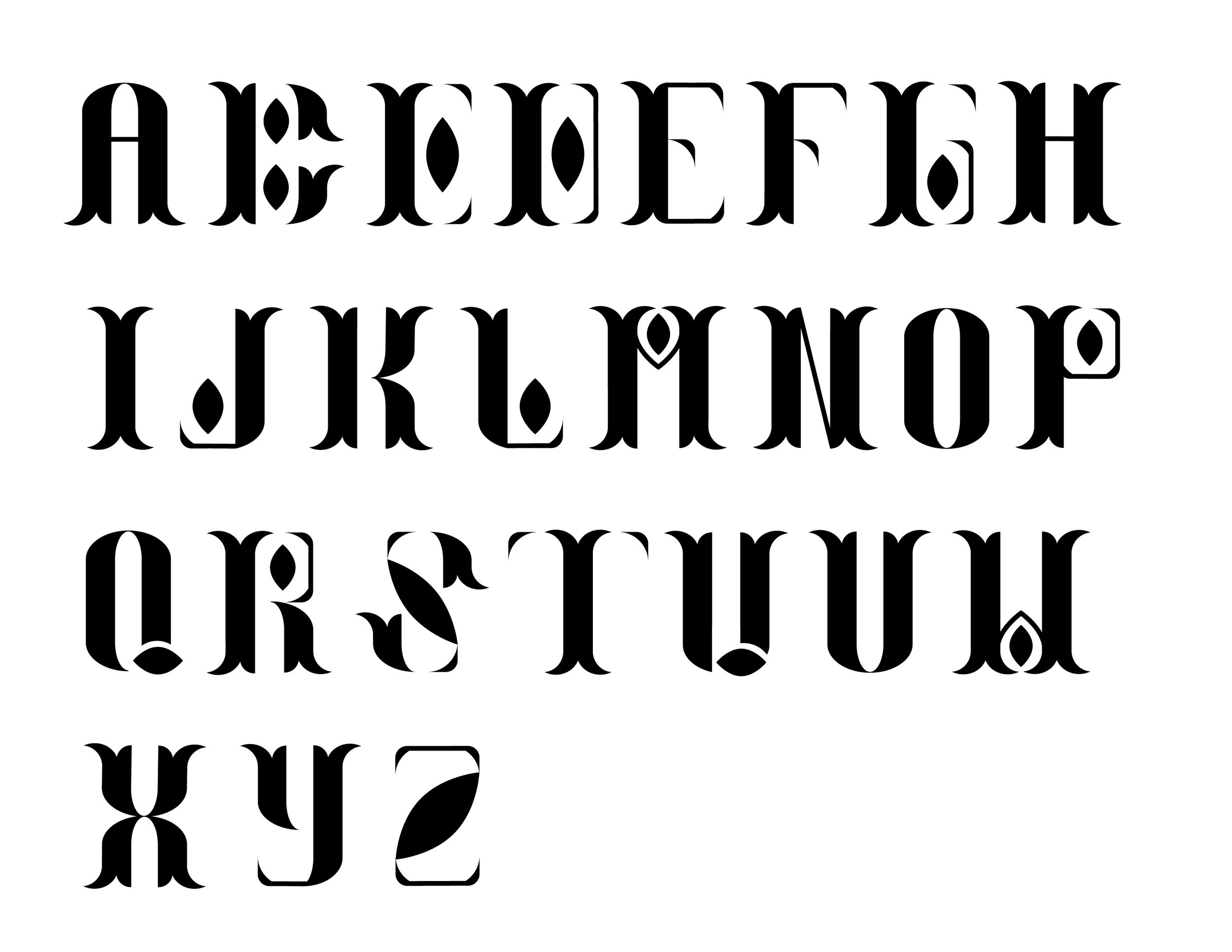
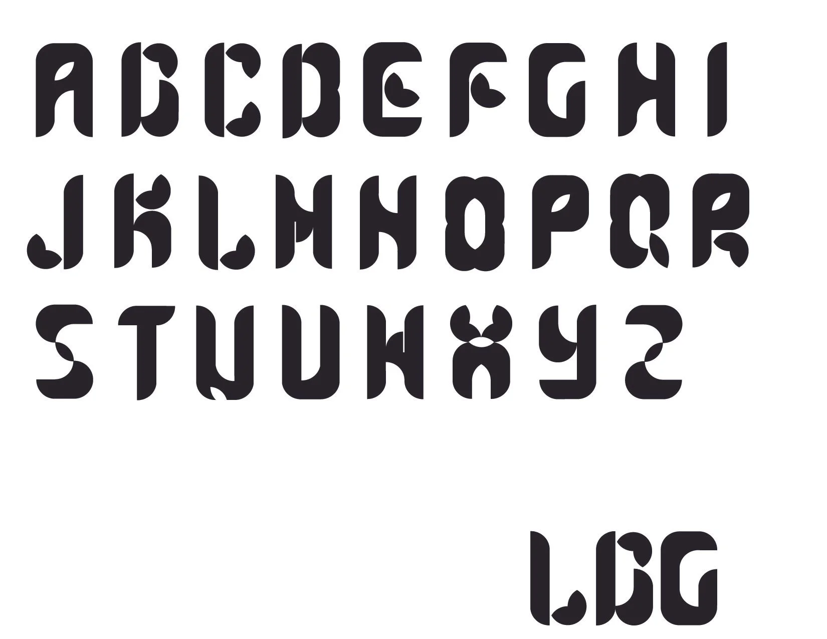
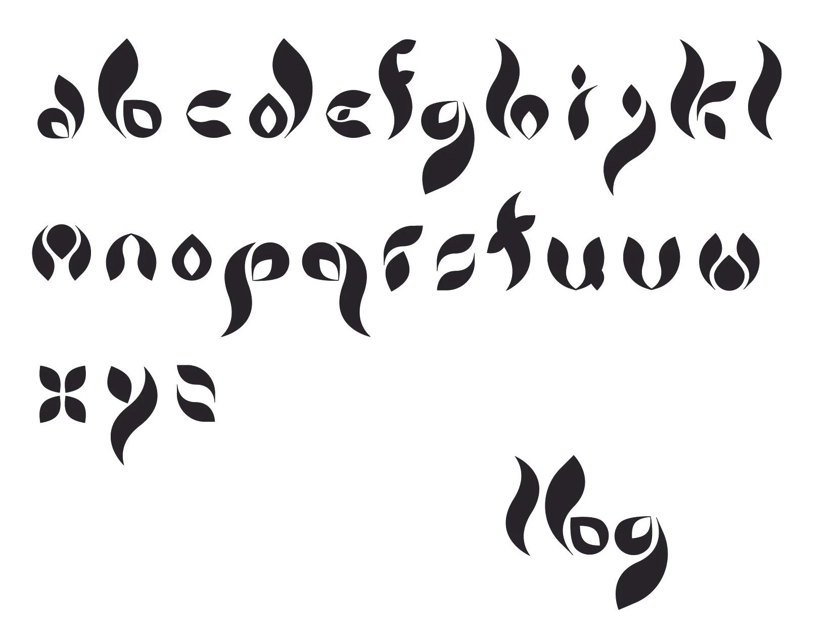
Liberty Botanic Gardens wanted their display typeface and new logo to resemble what the institution is all about, plants, growth, and historic structure. Leaf, petal, and seed shapes were used to create the foundations for key letterforms before adapting the motifs to the rest of the alphabet.
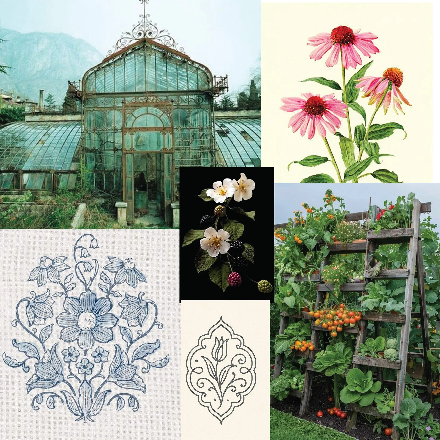
Moodboard & Alternate Designs
Applications & Explorations
Type samples to confirm legibility
Move the mouse from left to right to create patterns by scaling the letterforms.
Coded Letterform Patterns
Click the mouse over the composition space to see a randomized letter of the Greenhouse typeface.
Try It Out!
Type anything into the white box underneath the composition to see it in the Greenhouse typeface. Your text will always be in all-caps as Greenhouse is designed only in capitals.
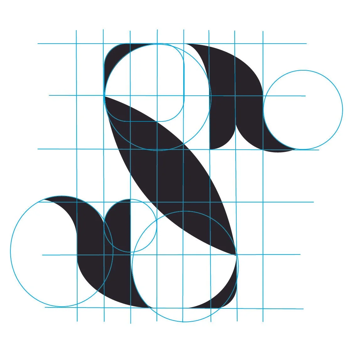
Underlying structure of all letterforms
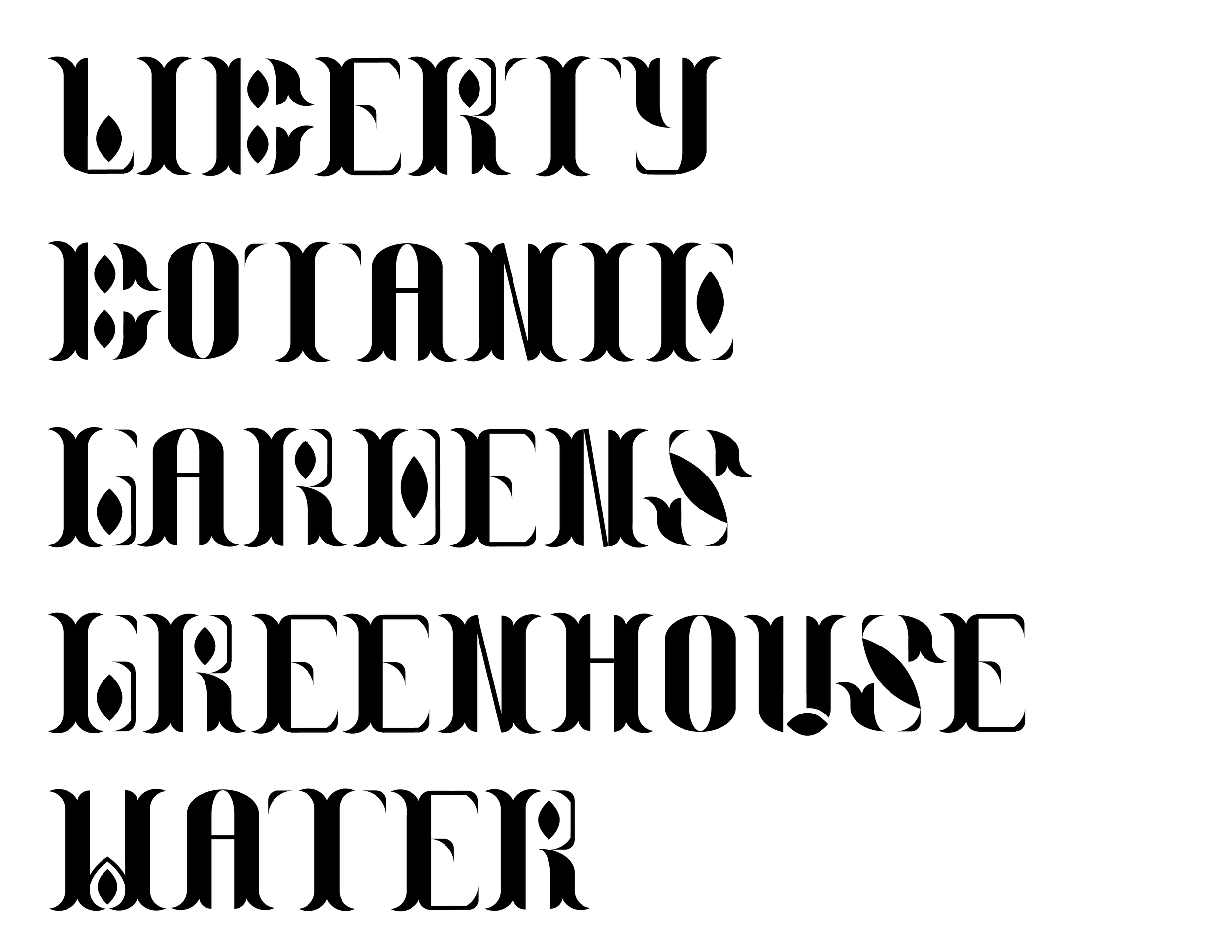
The final letterforms took inspiration from both natural forms such as leaves, plants, and seeds, as well as the architectural elements of greenhouses.
Greenhouse features high thin/thick stroke tapers, curving flourishes that mimic plant life, and seed shaped motifs throughout select letterforms.
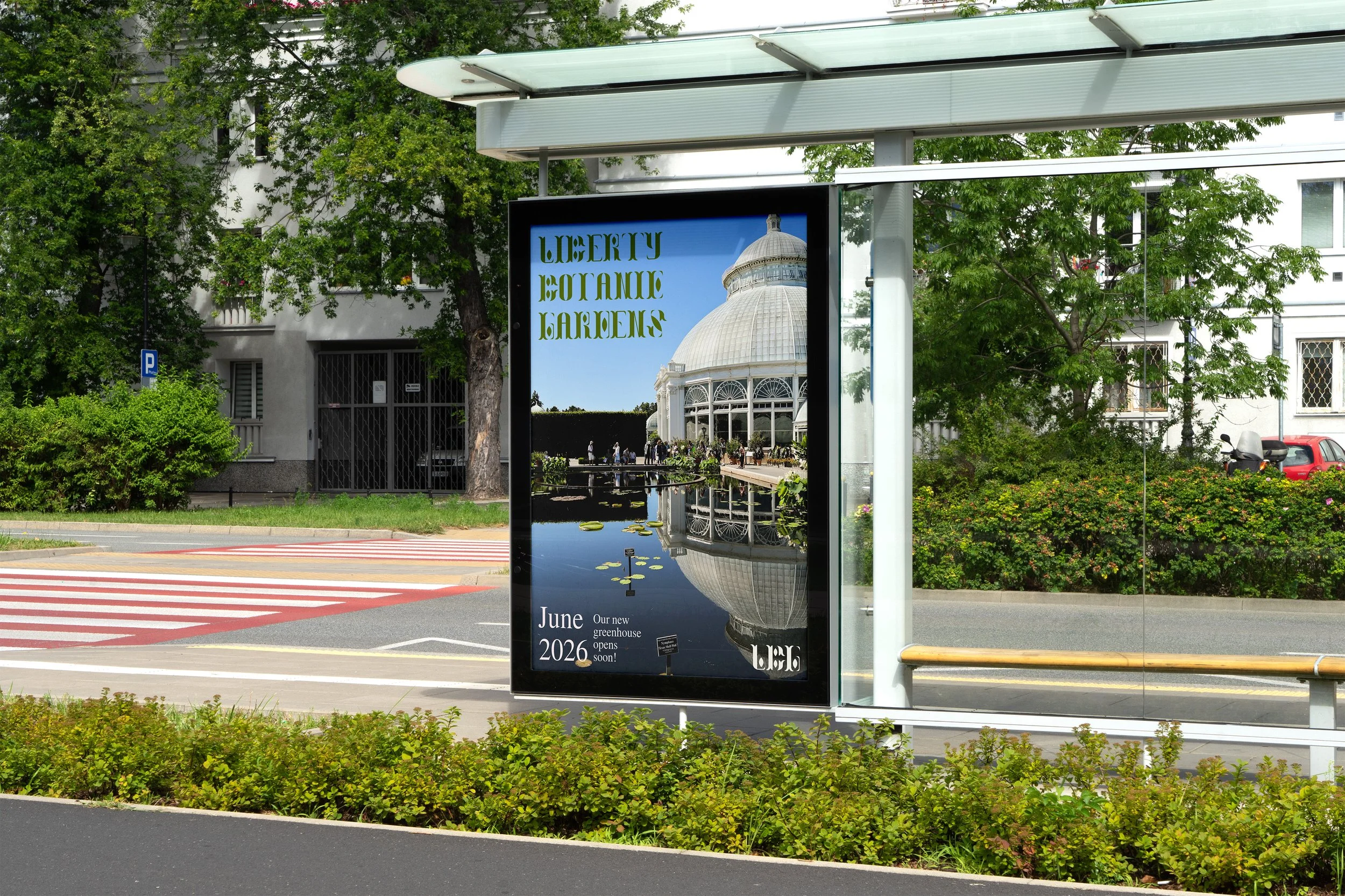
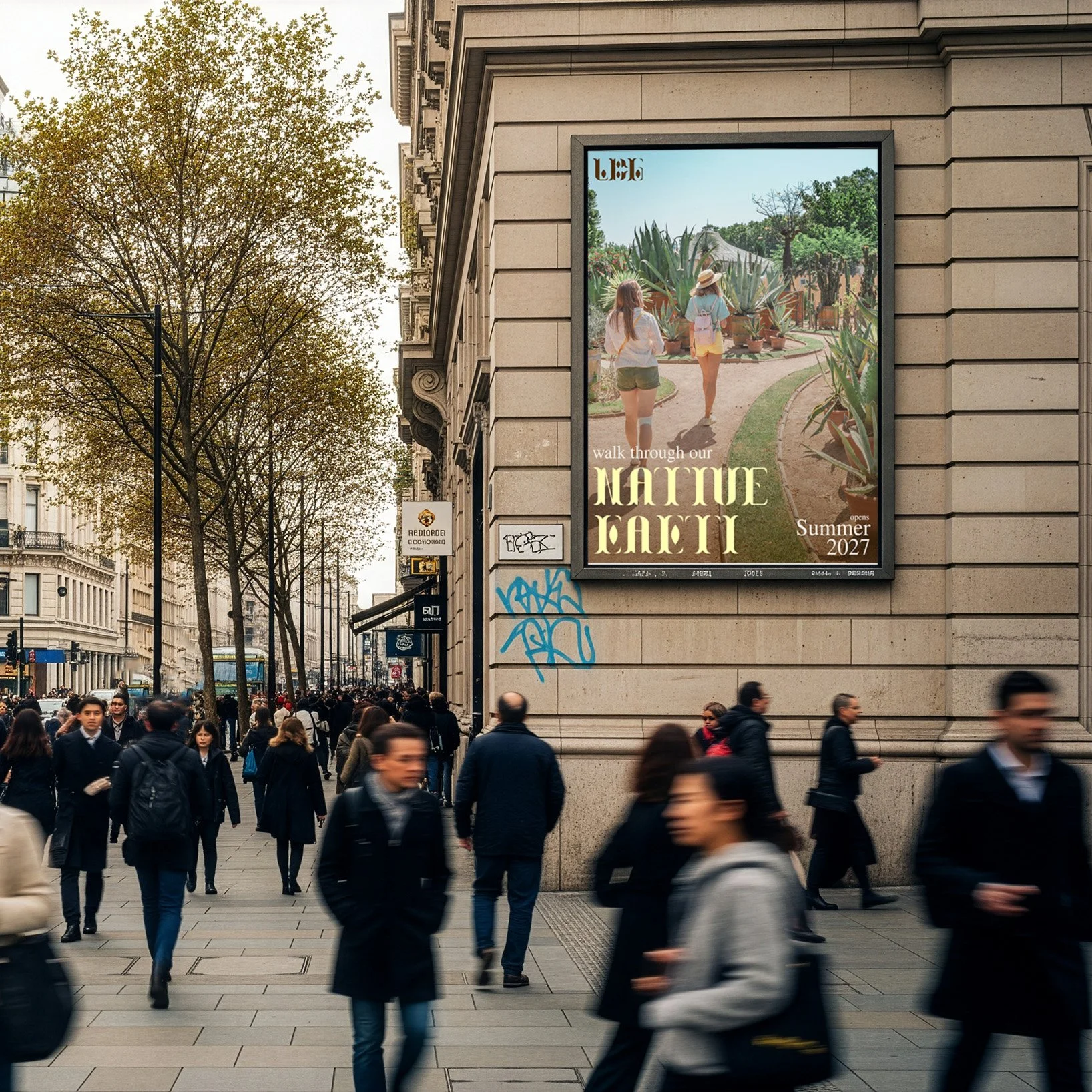
Poster Mockups
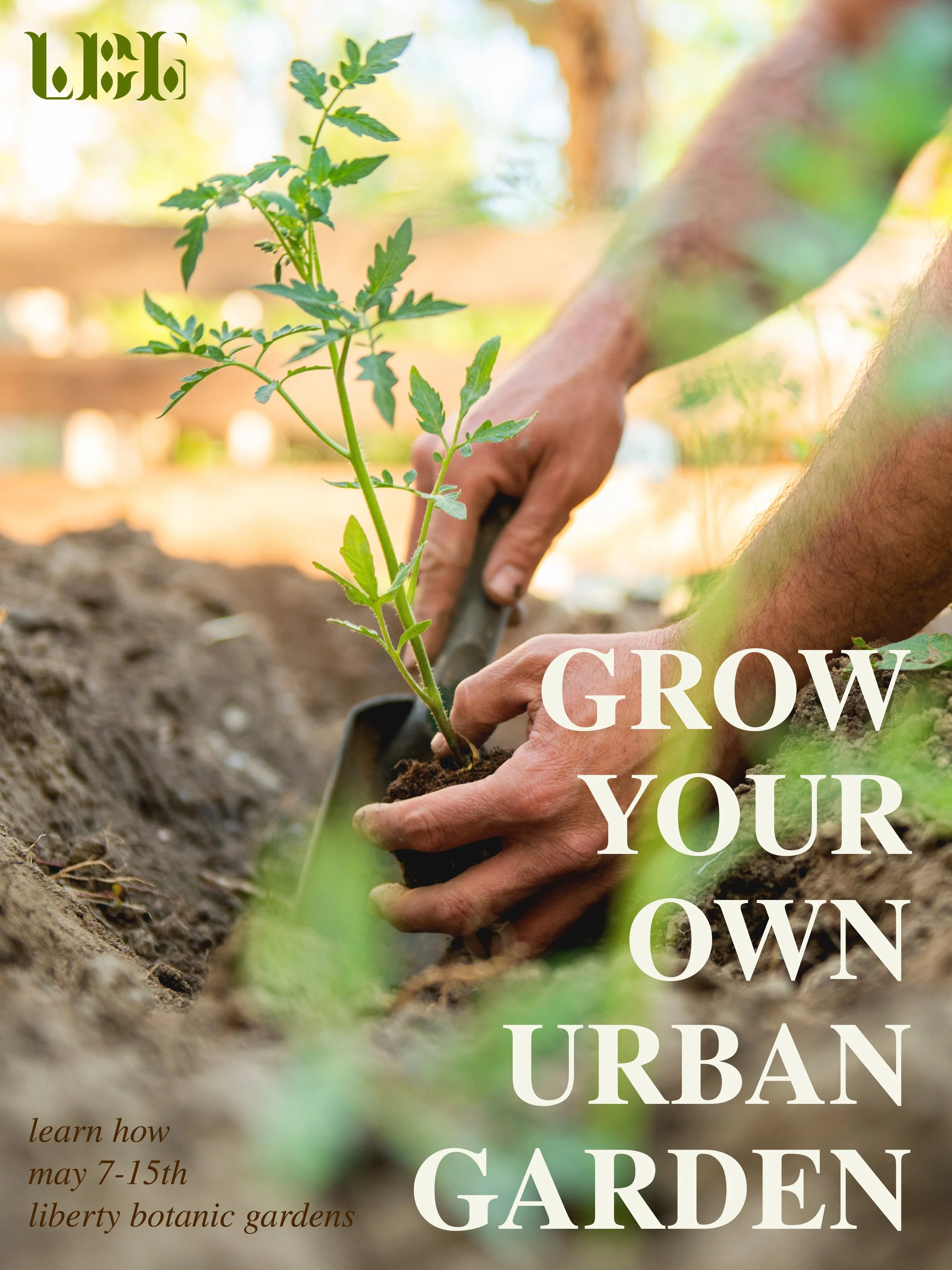
Poster Flats