Tiddlywinks
Packaging Re-design
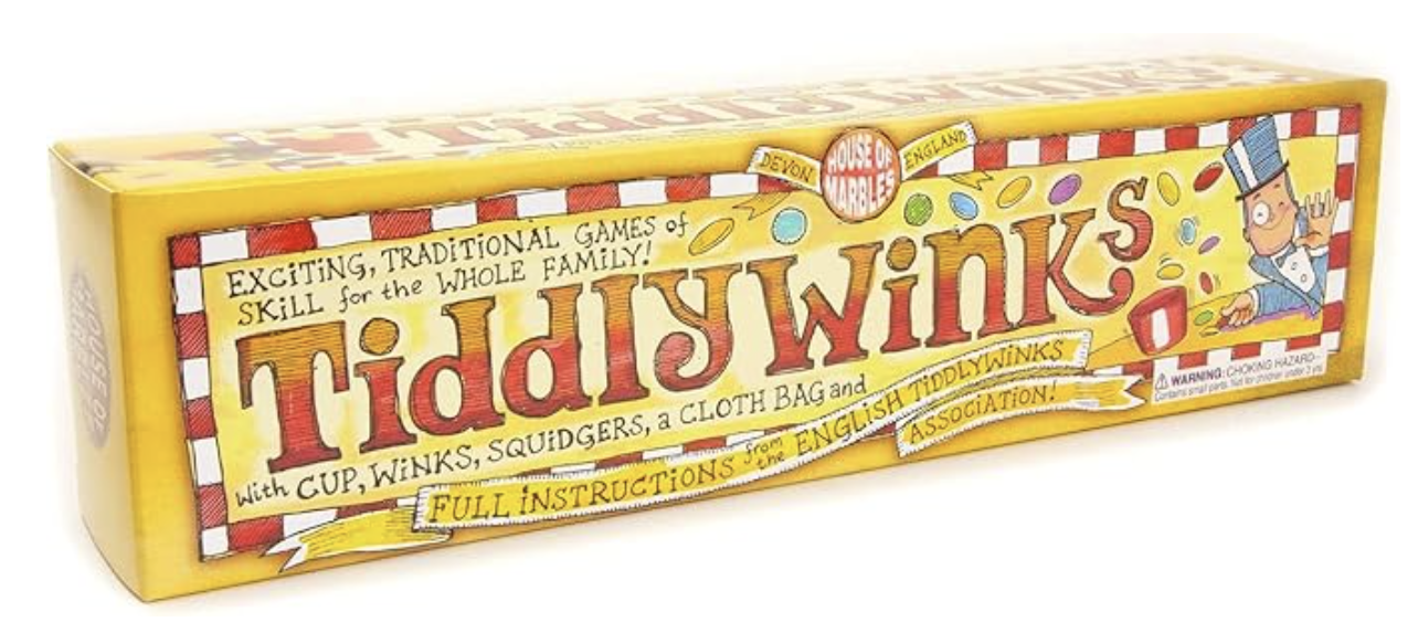
Current Packaging Design
My Design
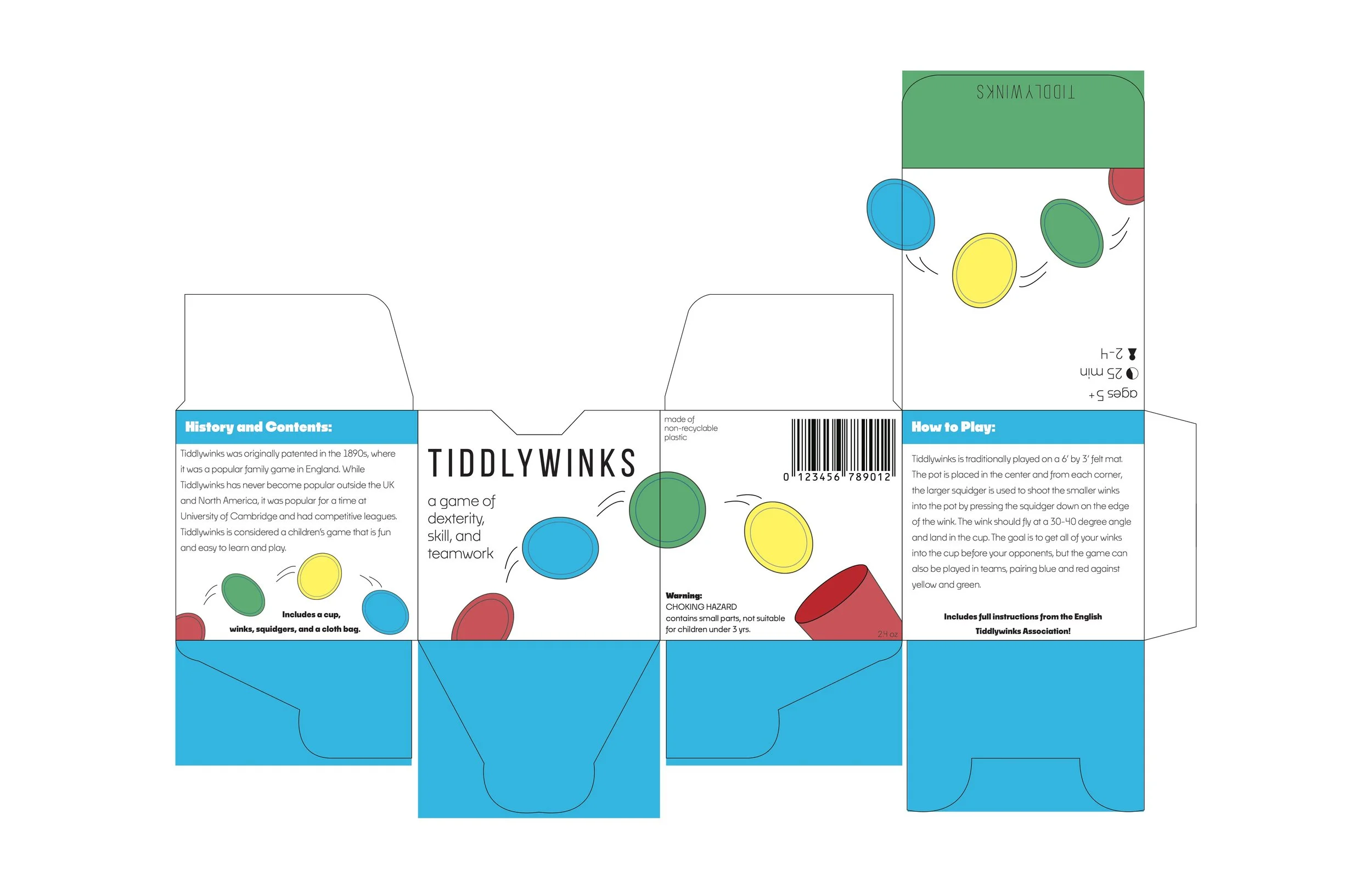
Final Die-line
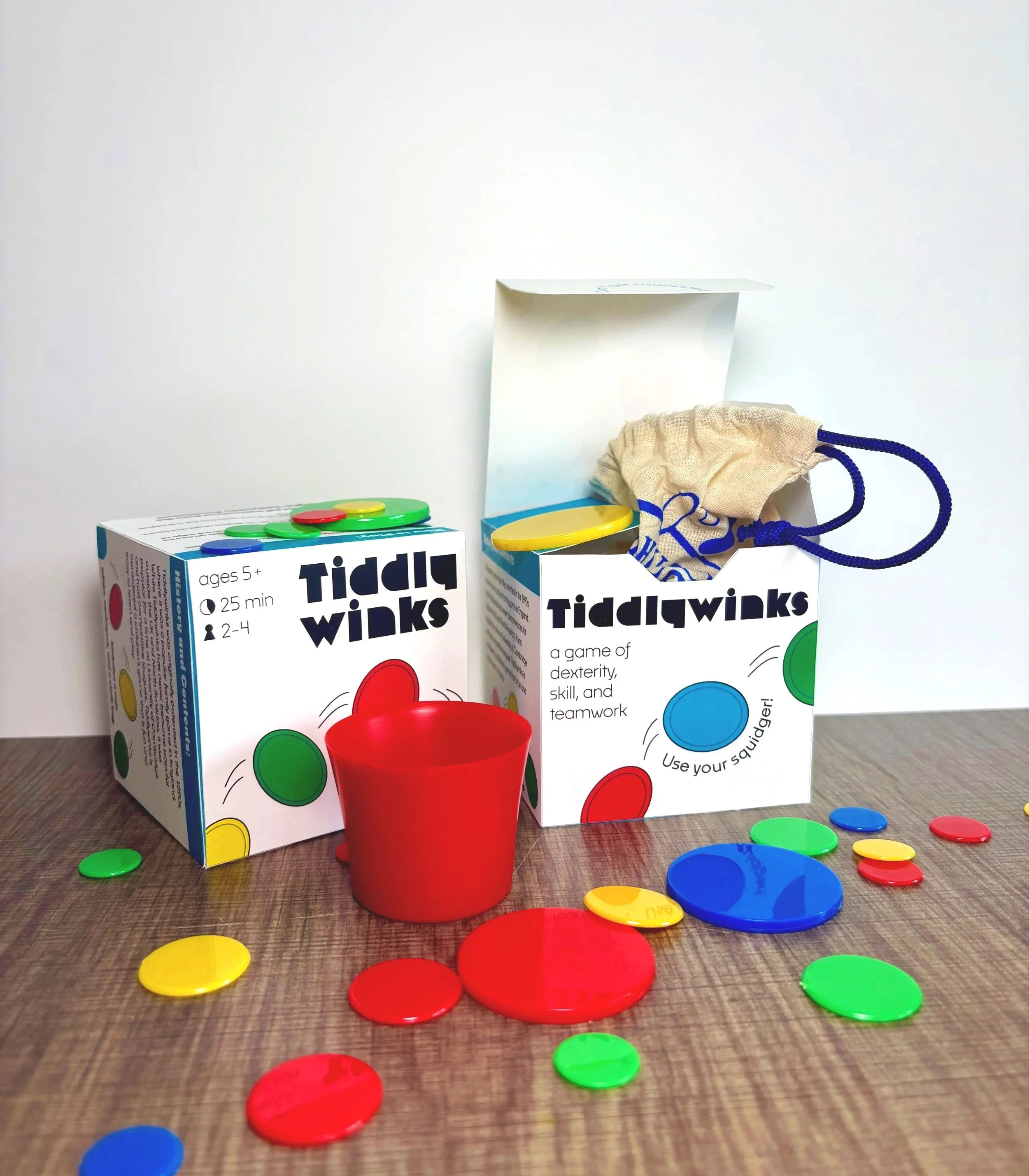
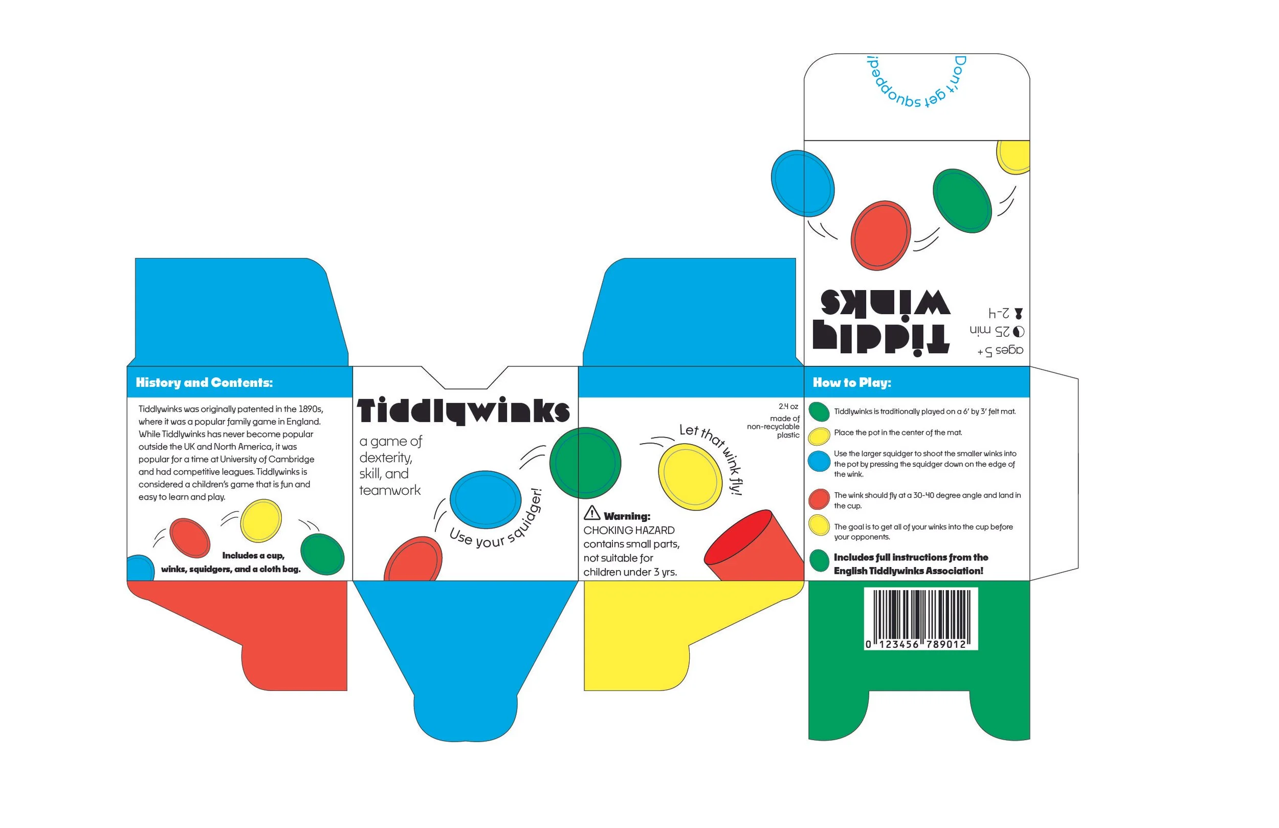
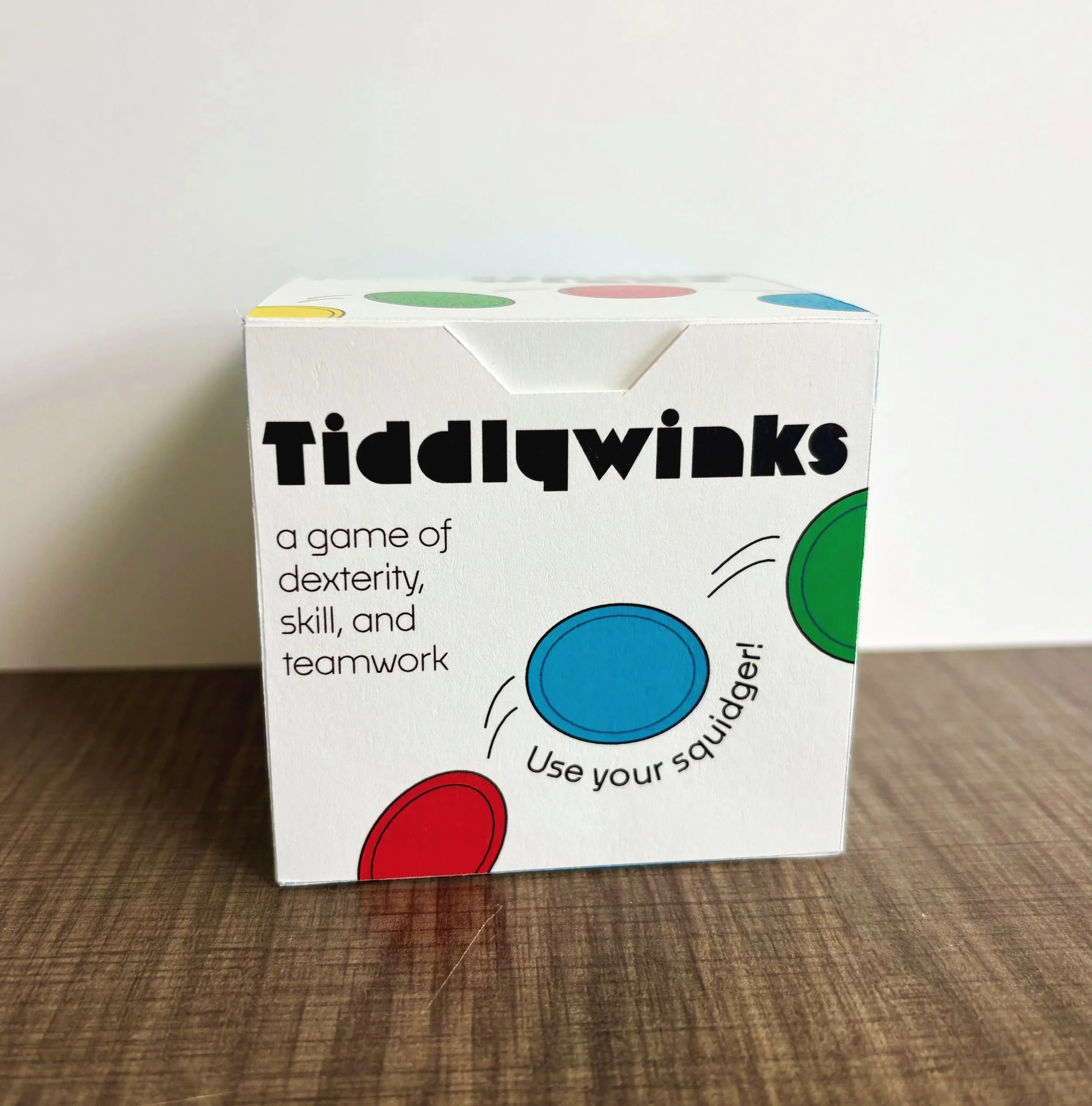
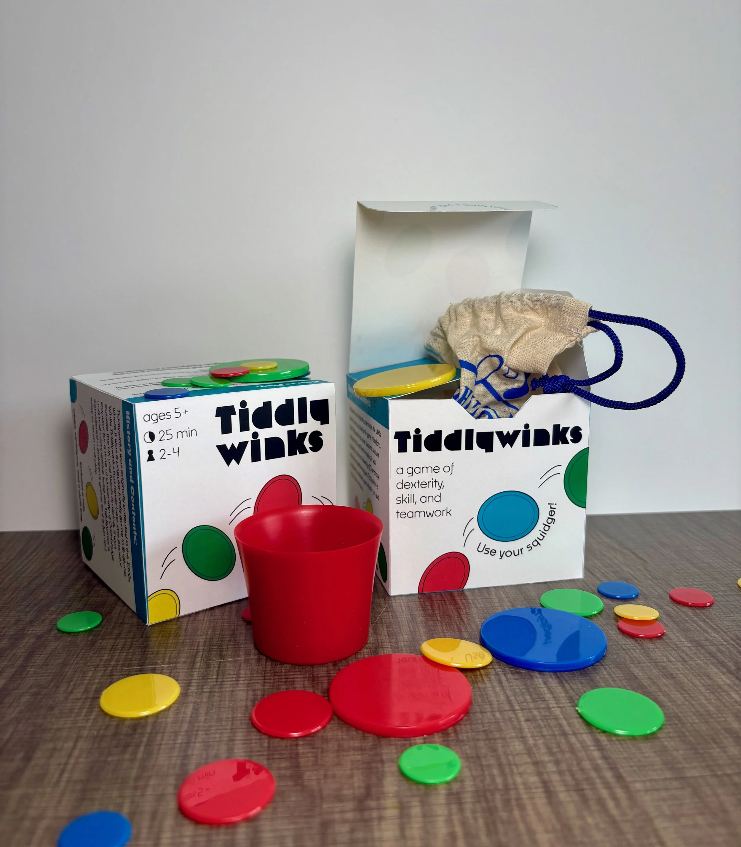
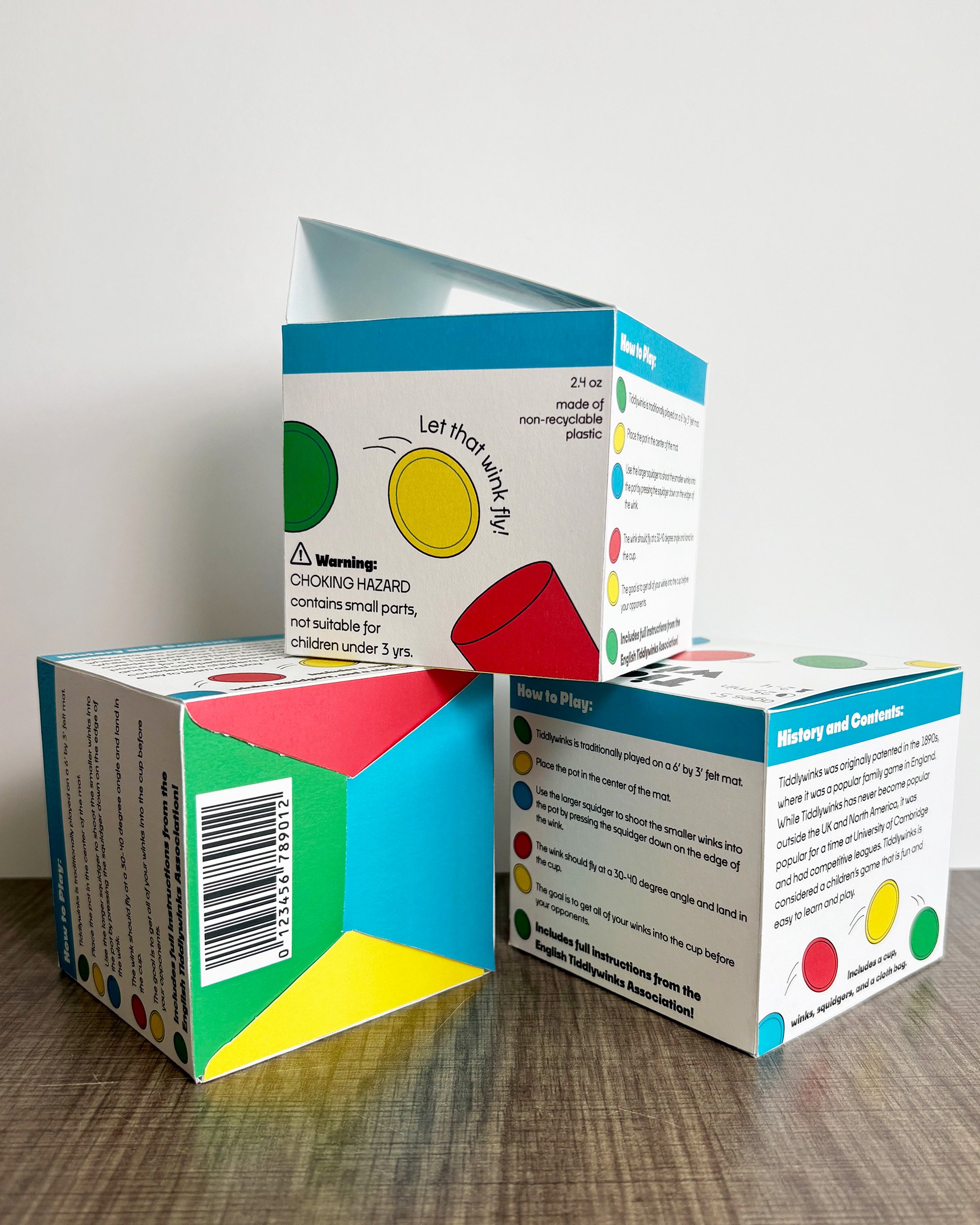
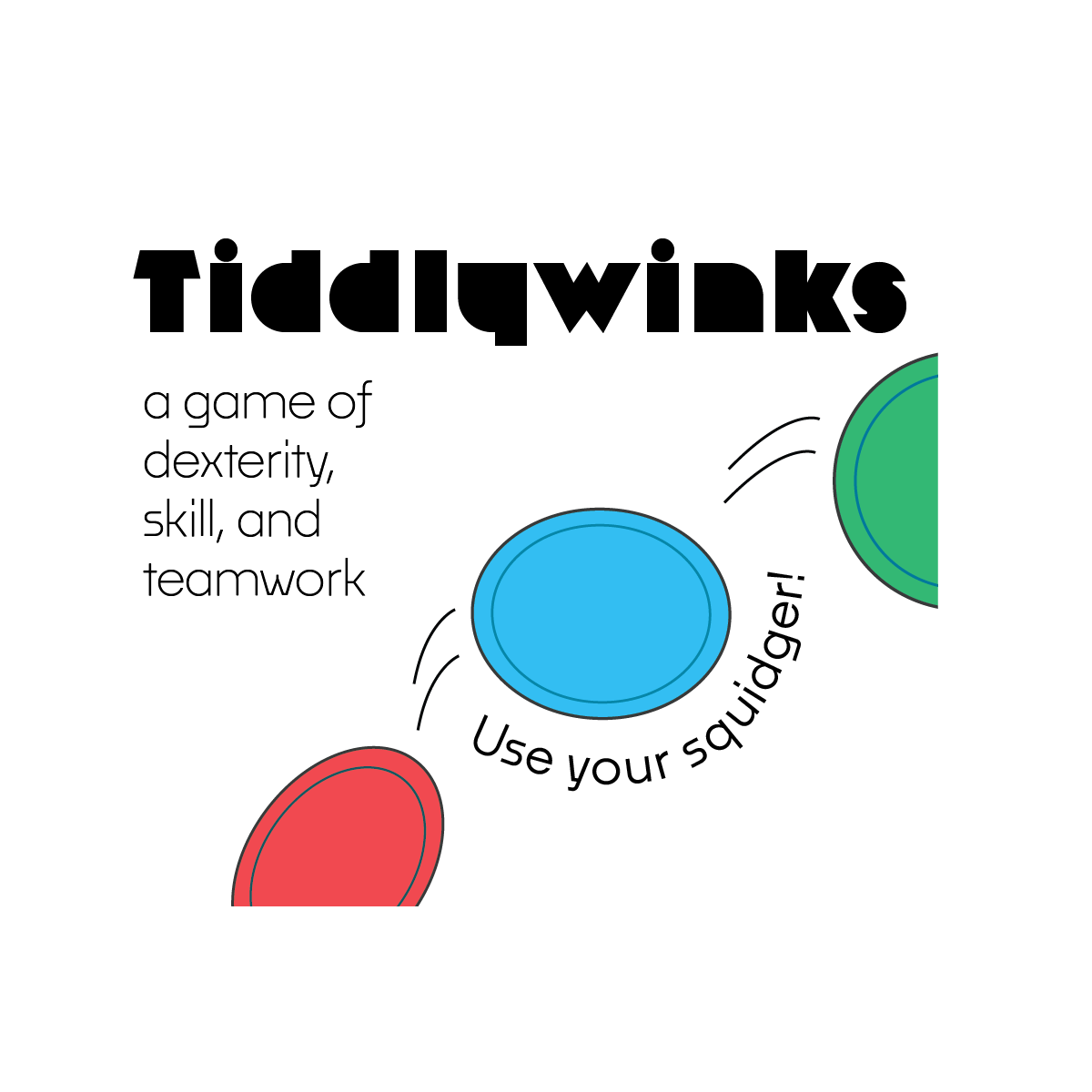
Tiddlywinks needed a re-brand to stand out among the many other games on the shelves. As a family/group oriented game, Tiddlywinks is simple to learn, easy to play, and tons of fun as players attempt to flip their winks into the central pot. This fast movement of the winks through the air was important in capturing the liveliness of the game on the packaging itself.
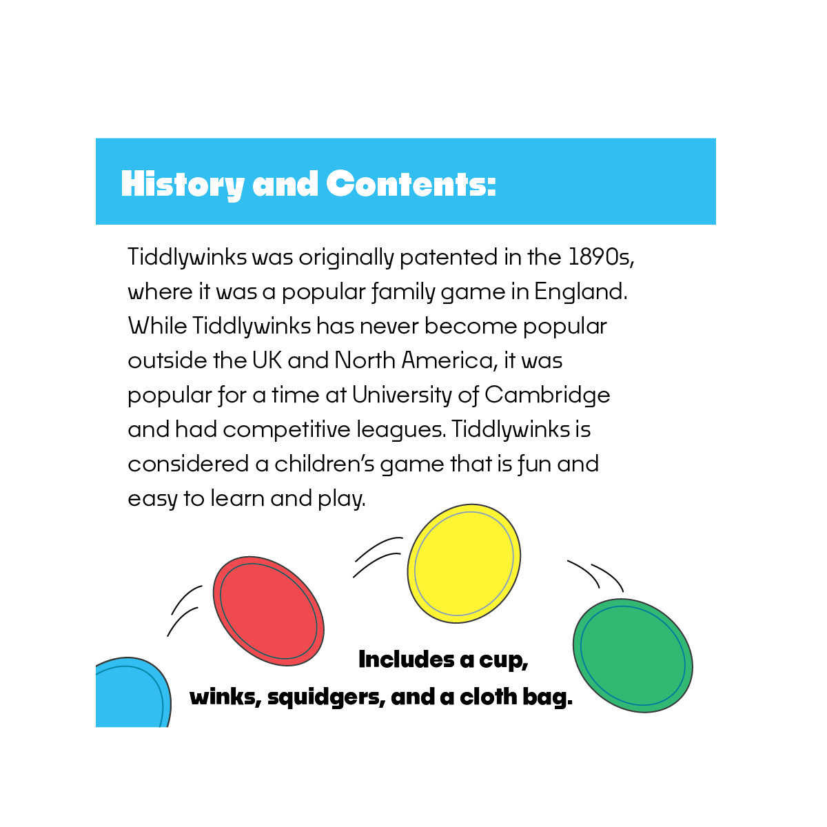
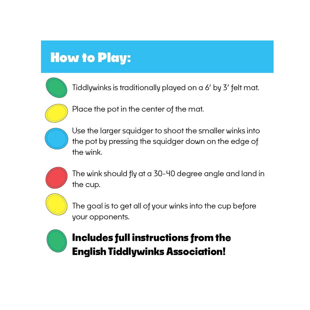
Clean shapes and bright colors grab the attention of shoppers while simple instructions and game history allow the reader to learn about the gameplay and contents.
Concept Variations
Mascot Imagery
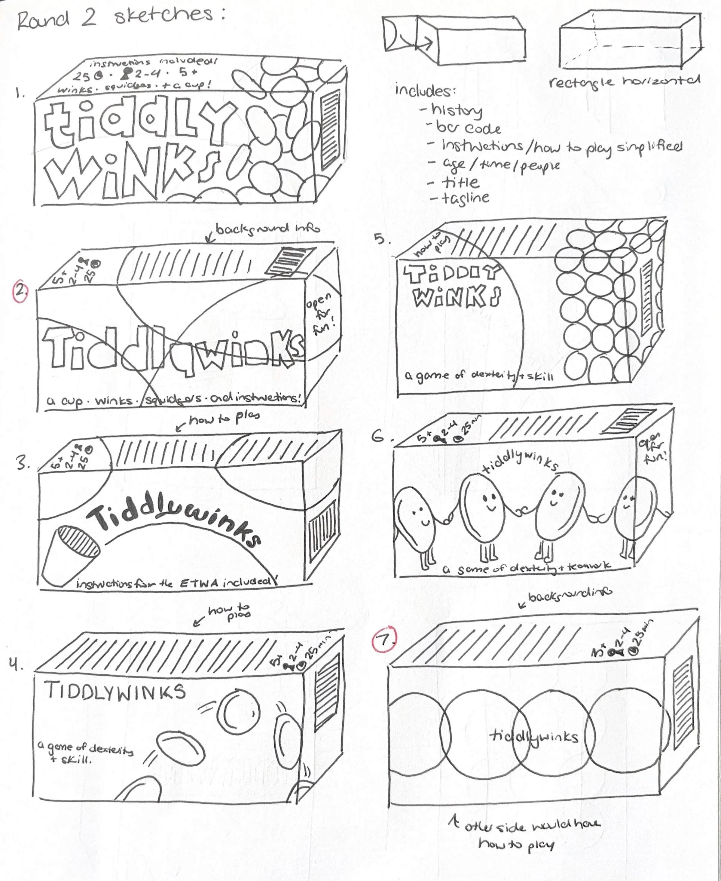
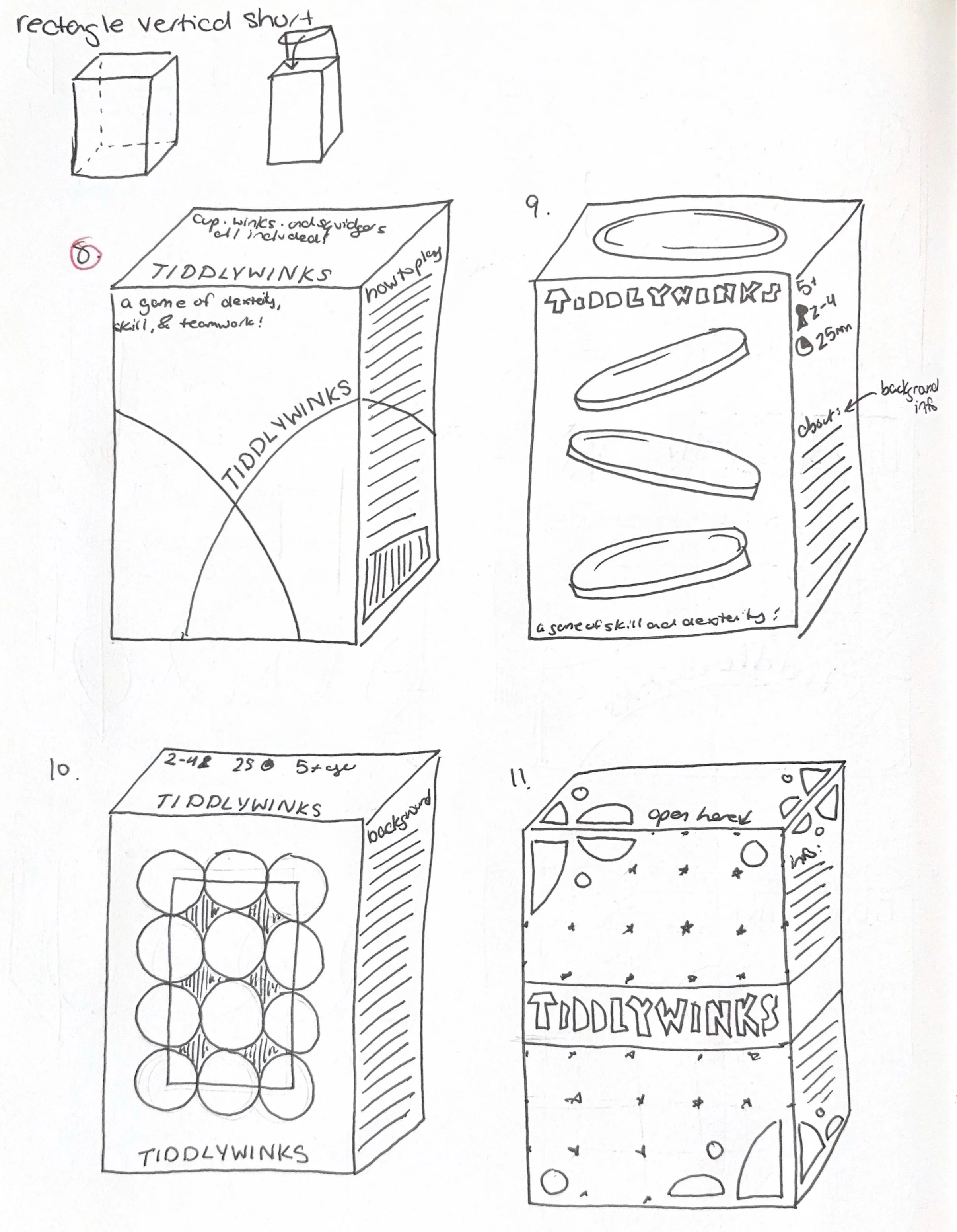
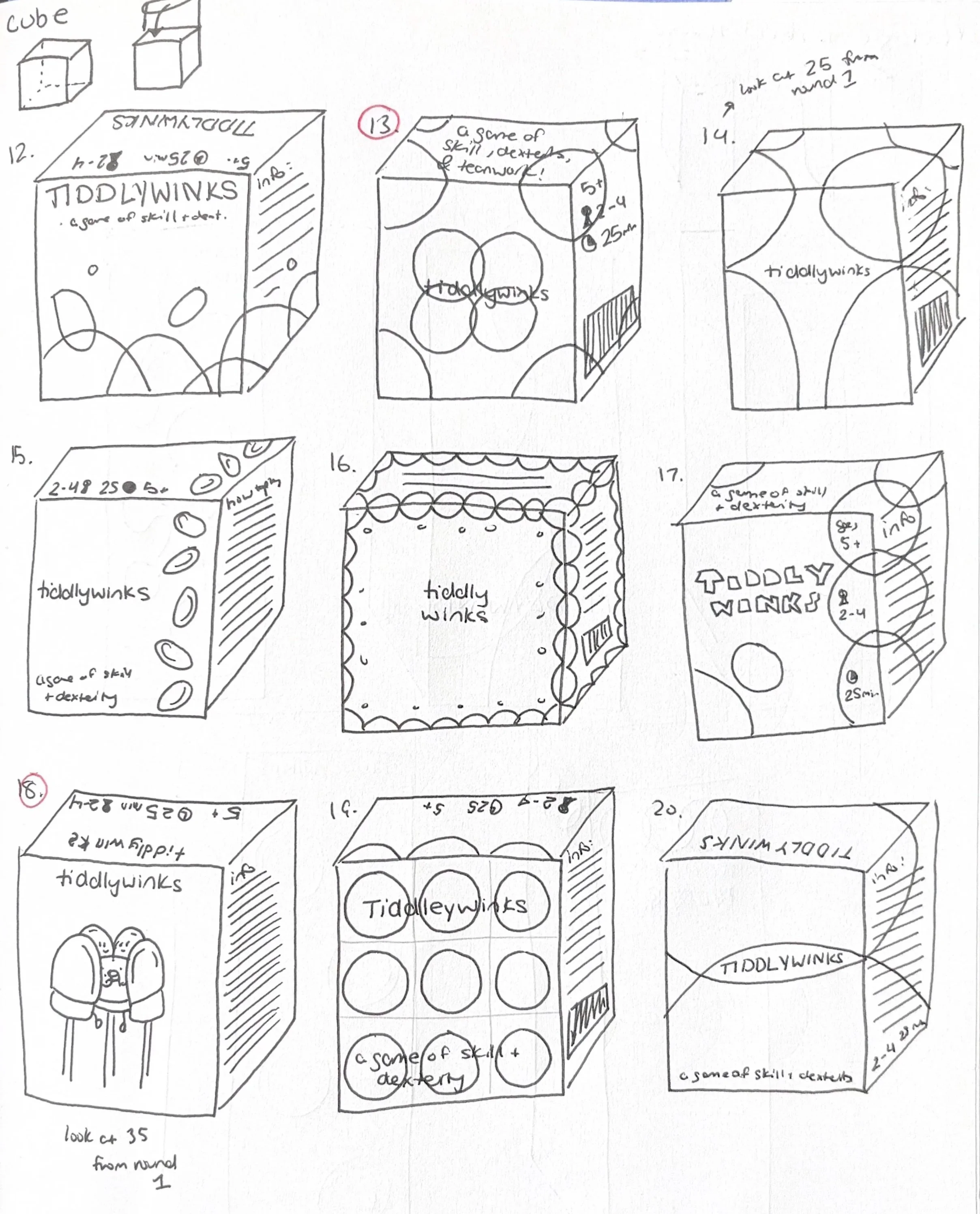
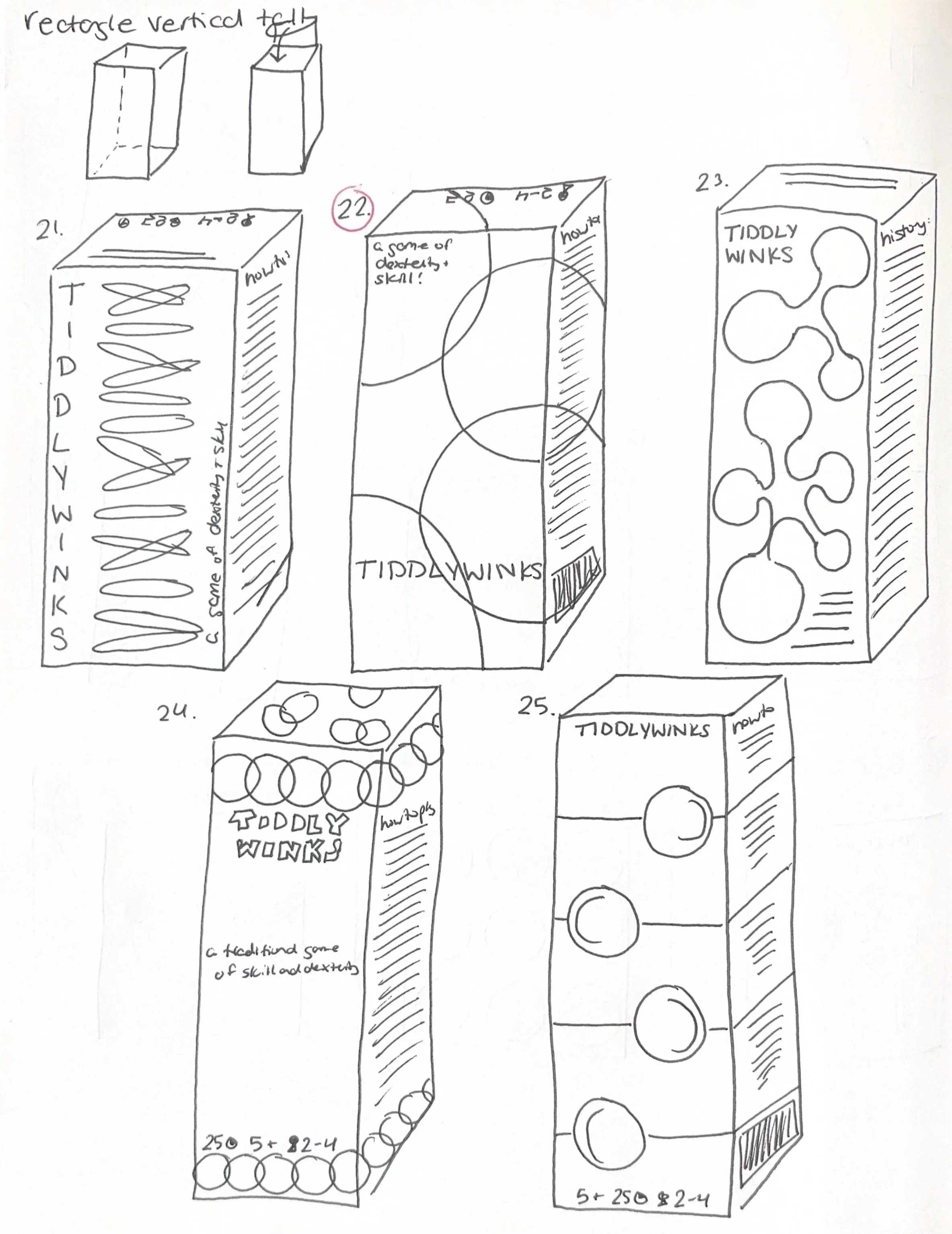
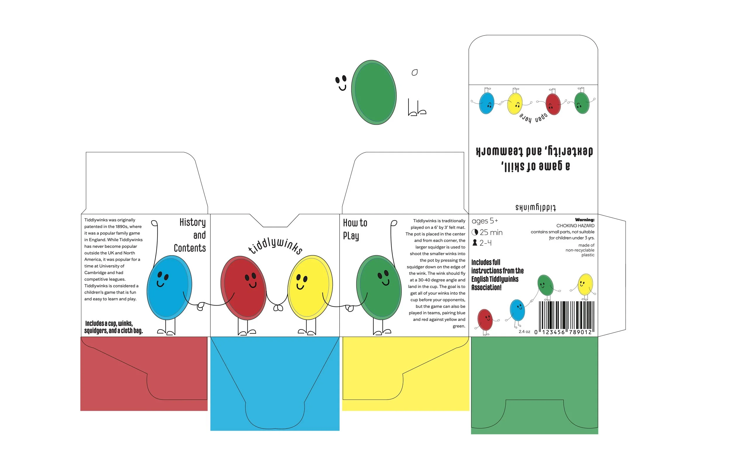
A more playful and child-oriented direction, this concept explored making the winks personified, giving them smiling faces and having them hold hands. This emphasizes the team and family aspect of the gameplay.
Chosen Concept
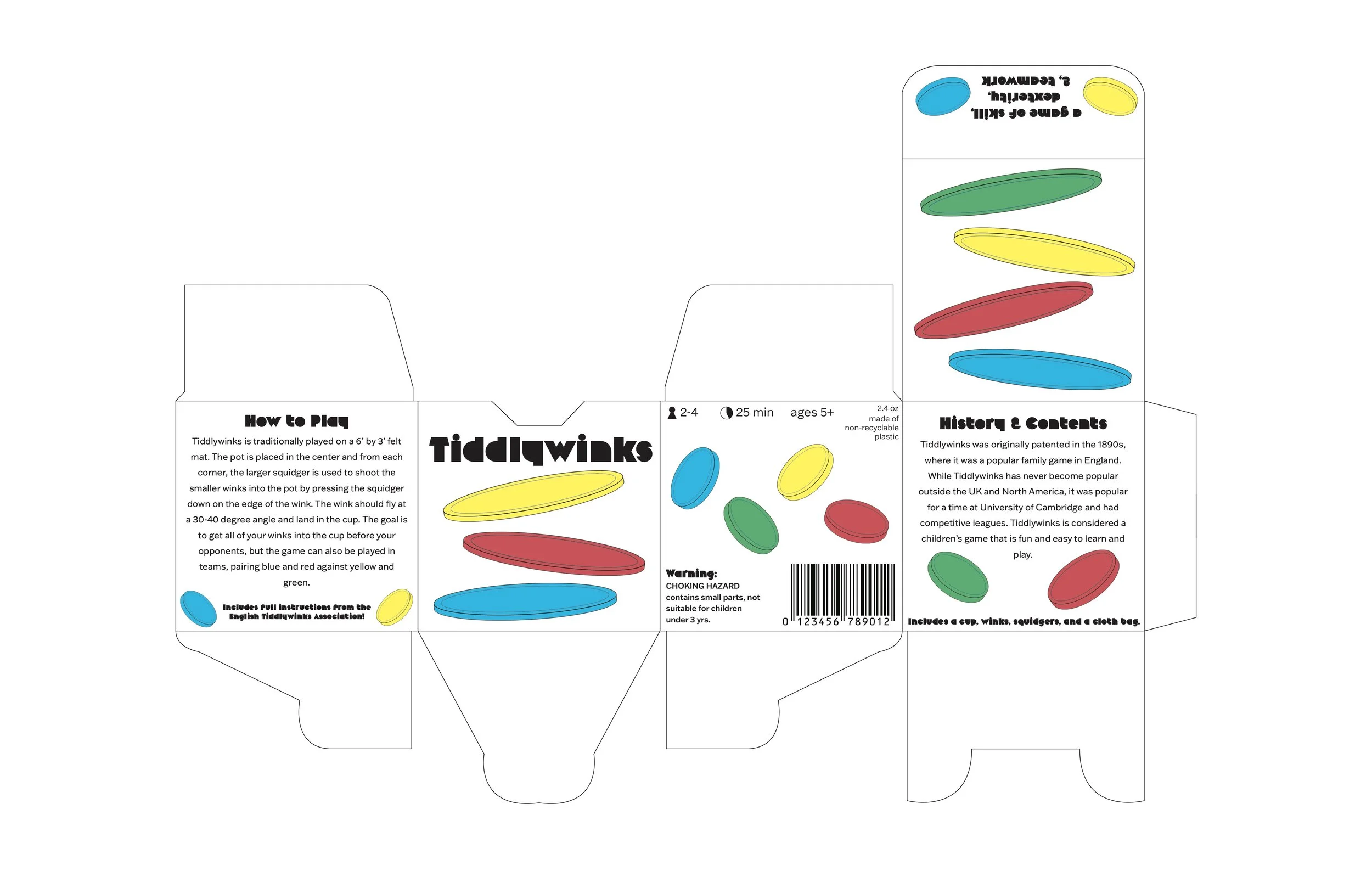
This concept focuses on the actions of gameplay and the goal of the game overall, getting the winks to fly through the air and land in the central red pot. By capturing this movement across various parts of the package, the design grabs attention from all sides, making it the top choice for refinement.
Minimal & Geometric Design
With limited sections of color and an emphasis on geometric forms in the typeface and shapes, this concept deviates the most from traditional Tiddlywinks packaging.
Panel Flats
Sketches